Flutter UI导引
安装Flutter
创建一个Flutter程序
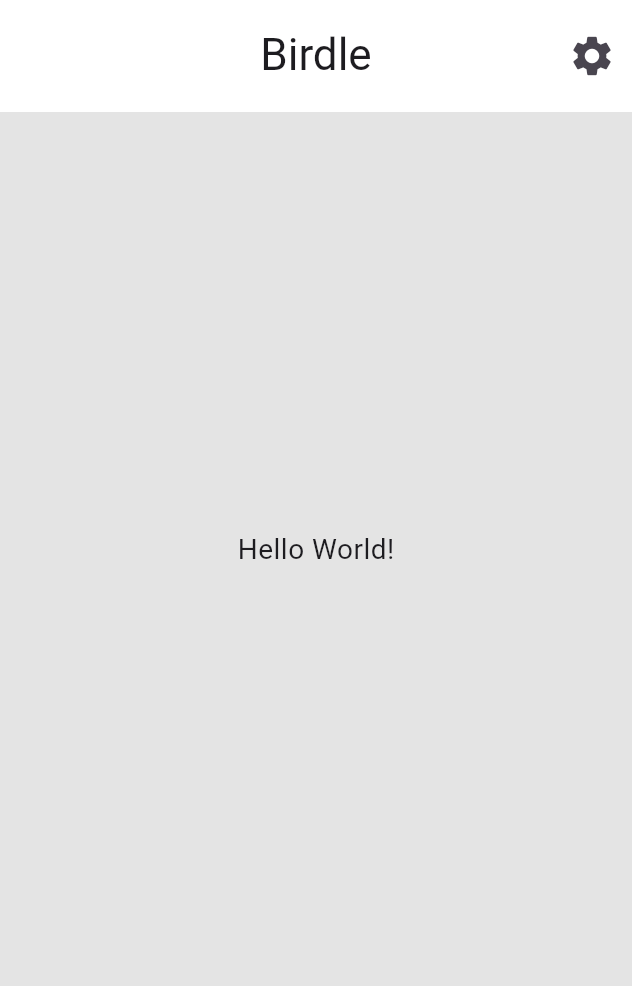
你将要做什么 What you'll build
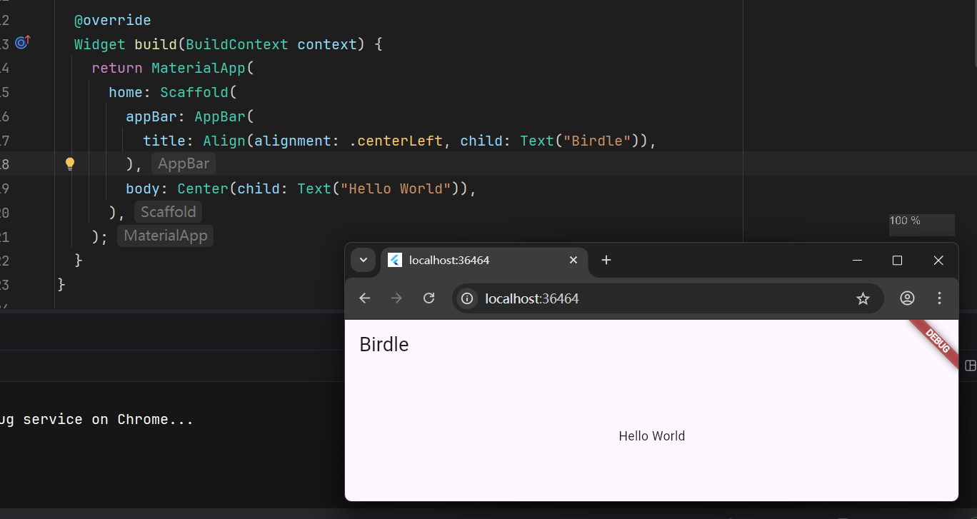
In this first section of the Flutter tutorial, you'll build the core UI of an app called 'Birdle', a game similar to Wordle, the popular New York Times game.
在Flutter教程的第一章,你将为一个名为Birdle的程序(一款类似于 连字成词 的游戏)制作关键UI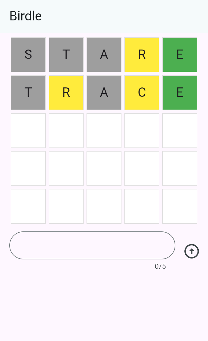
By the end of this tutorial, you'll have learned the fundamentals of building Flutter UIs, and your app will look like the following screenshot (and it'll even mostly work 😀).
在学习完教程后,你将理解如何构建简单的Flutter UI,你的程序效果大概如图上所示(并且大概率是能跑的)
创建Flutter项目
The first step to building Flutter apps is to create a new project. You create new apps with the Flutter CLI tool, installed as part of the Flutter SDK.
要致富,先新建文件夹。你将使用Flutter CLI tool 创建新应用程序项目。Flutter CLI是Flutter SDK的一部分
Open your terminal or command prompt and run the following command to create a new Flutter project:
打开你的终端或指令输入框,运行下面的指令以创建新的Flutter项目:
flutter create birdle --emptyThis creates a new Flutter project using the minimal "empty" template
这会使用空模板 创建一个Flutter项目
检查代码 Examine the code
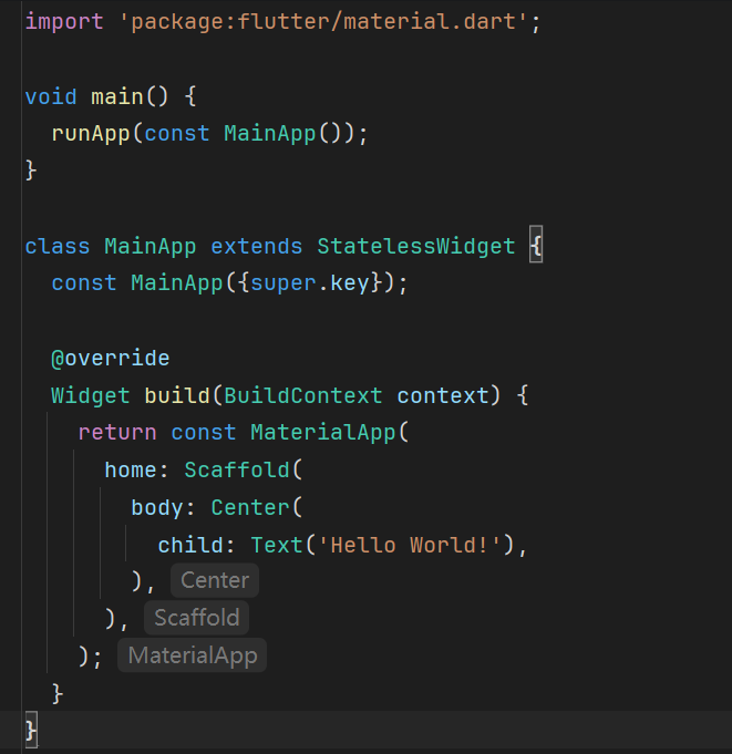
In your IDE, open the file at
lib/main.dart. Starting from the top, you'll see this code.
在你的IDE中,打开lib/main.dart,从文件顶部往下看,你会看到这样的代码:
void main() {
  runApp(const MainApp());
}
The
mainfunction is the entry point to any Dart program, and a Flutter app is just a Dart program. TherunAppmethod is part of the Flutter SDK, and it takes a widget as an argument. In this case, an instance of theMainAppwidget is being passed in.
Dart程序的入口函数统一为main函数,并且Flutter程序本质上也是Dart程序。runApp方法由Flutter SDK提供,接受一个widget参数。在这个例子中,传入函数的是MainAppwidget
Just below the
mainfunction, you'll find theMainAppclass declaration.
就在main函数下面,你会看到MainApp的定义
class MainApp extends StatelessWidget {
  const MainApp({super.key});

  @override
  Widget build(BuildContext context) {
    return const MaterialApp(
      home: Scaffold(
        body: Center(
          child: Text('Hello World!'),
        ),
      ),
    );
  }
}
MainAppis the root widget, as it's the widget that's passed intorunApp. Within this widget, there's abuildmethod that returns another widget calledMaterialApp. Essentially, this is what a Flutter app is: a composition of widgets that make up a tree structure called the widget tree.
由于被传入函数的是MainApp,所以它是根组件。MainApp实现了(重载了)build方法,调用了一个外部组件(MaterialApp)。Flutter程序本质上就是组件树的组合产物。
注意
widget 在本文中均译为 组件
Your job as a Flutter developer is to compose widgets from the SDK into larger, custom widgets that display a UI.
你作为Flutter开发者的任务就是用SDK提供的组件构建一个更大的自定义UI
At the moment, the widget tree is quite simple:
就目前而言,组件树还没有难到哪去: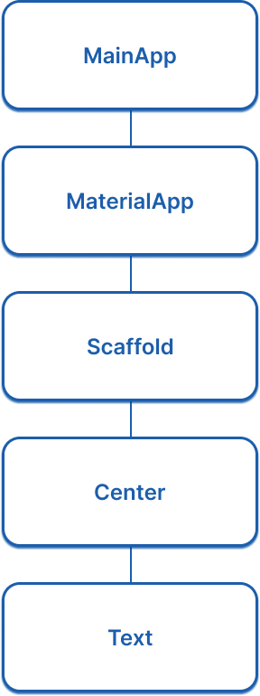
先跑两下看看 Run your app
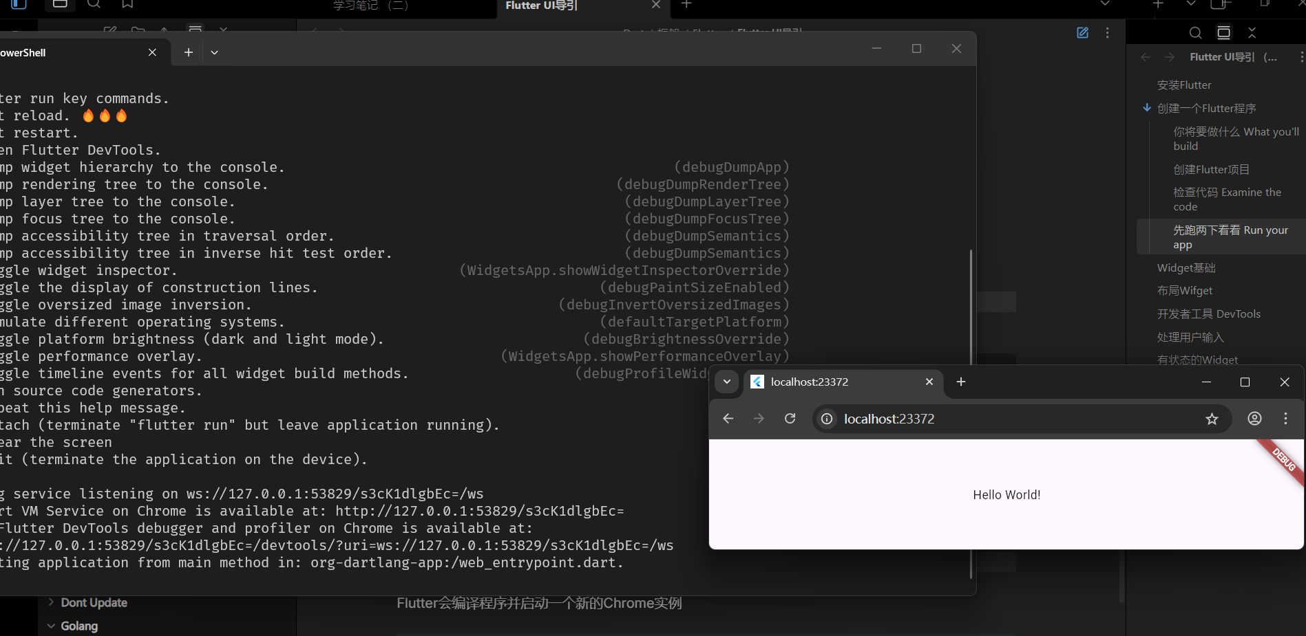
- In your terminal, navigate to the root directory of your created Flutter app:
在终端里,导航到刚刚创建的项目目录:
cd birdle
- 运行程序
flutter run -d chromeThe app will build and launch in a new instance of Chrome.
Flutter会编译程序并启动一个新的Chrome实例
体验热部署 Use hot reload
Stateful hot reload, if you haven't heard of it, allows a running Flutter app to re-render updated business logic or UI code in less than a second – all without losing your place in the app.
以防你不知道,有状态的热部署,允许你在不丢失APP状态的情况下,在不到一秒钟的时间内看到Flutter程序重新渲染事务或UI
In your IDE, open the
main.dartfile and navigate to line ~15 and find this code:
在你的IDE里,打开main.dart,找到第十五行这行代码:
child: Text('Hello World!'),Change the text inside the string to anything you want. Then, hot-reload your app by pressing
rin the terminal where the app is running. The running app should instantly show your updated text.
随便改成别的什么字符串,然后在终端里按下r键来重新部署程序(确保程序还开着),程序会立刻更新文本
测测你的梦 Test yourself
runApp函数的作用是什么
What is the purpose of the
runAppfunction in a Flutter application?
It takes a widget as an argument and makes it the root of the widget tree.The
runAppfunction inflates the given widget and attaches it to the screen, making it the root of the widget tree.
如何触发热部署
How do you trigger a hot reload while a Flutter app is running in the terminal?
Press `r` in the terminal.Pressing
rin the terminal where the app is running triggers a hot reload.
Widget基础
在开始之前 Before you start
This app relies on a bit of game logic that isn't UI-related, and thus is outside the scope of this tutorial. Before you move on, you need to add this logic to your app.
APP需要一点与UI无关的游戏逻辑。游戏逻辑实现无关本教程,因此在你继续之前你需要手动把额外逻辑加到项目例
- Download the following Dart file and save it as
lib/game.dartin your project directory.
首先下载给定Dart文件,放在lib/目录下
- To enable access to the types defined in the
game.dartlibrary, add an import to it from yourlib/main.dartfile:
在lib/main.dart里导入game.dart:
import 'package:flutter/material.dart';

import 'game.dart';
注
You might notice the
legalGuessesandlegalWordslists only contain a few words. The full lists combined have over 10,000 words and were omitted for brevity. You don't need the full lists to continue the tutorial. When you're testing your app, make sure to use the words from those lists.
你会发现legalGuesses和legalWords里只有寥寥几个单词。完整的列表有10000多个单词,出于教程精简的目的,不提供完整列表。你不需要完整列表也能继续教程。当你开始测试程序时,请确保用的是满血列表的样例
Alternatively, you can find the full lists in this GitHub repository, as well as instructions to import it into your project.
当然,你可以在Github仓库里找到完整清单,并添加到你的项目中
无状态组件原理 Anatomy of a stateless widget
A
Widgetis a Dart class that extends one of the Flutter widget classes, in this caseStatelessWidget.
Widget组件是Flutter组件类之一的子类,在这里,它的父类是StatelessWidget
Open your
main.dartfile and add this code below theMainAppclass, which defines a new widget calledTile.
打开main.dart,在MainApp类下面加上代码,定义一个新的组件类Tile:
构造函数 Constructor
The
Tileclass has a constructor that defines what data needs to be passed into the widget to render the widget. In this case, the constructor accepts two parameters:
Tile类的构造函数定义了要渲染这个组件需要哪些数据。在本例中,构造函数接受两个参数:
- A
Stringrepresenting the guessed letter of the tile.
-String变量:玩家当前猜测的字母- A
HitTypeenum value represent the guess result and used to determine the color of the tile. For example,HitType.hitresults in a green tile.
HitType枚举变量:根据是否猜对判断要把积木渲染成什么颜色。例如HitType.hit表示要把积木渲染成绿色背景的积木
Passing data into widget constructors is at the core of making widgets reusable.
组件复用的核心就是把数据传递给组件的构造函数
重载build方法 Build method
Finally, there's the all important
buildmethod, which must be defined on every widget, and will always return another widget.
然后就是最为重要的build方法,每个组件都必须实现的方法,必须永远返回另一个组件
class Tile extends StatelessWidget {
  const Tile(this.letter, this.hitType, {super.key});

  final String letter;
  final HitType hitType;

  @override
  Widget build(BuildContext context) {
    return Container();
  }
}
使用自定义组件 Use the custom widget
When the app is finished, there will be 25 instances of this widget on the screen. For now, though, display just one so you can see the updates as they're made. In the
MainApp.buildmethod, replace theTextwidget with the following:
程序完成后,屏幕上会出现25个组件实例。就目前而言,我们只做一个,以便你能看清组件更新绘制过程。在MainApp.build方法中,把Text组件换成这个:
class MainApp extends StatelessWidget {
  const MainApp({super.key});

  @override
  Widget build(BuildContext context) {
    return const MaterialApp(
      home: Scaffold(
        body: Center(
          child: Tile('A', HitType.hit), // NEW
        ),
      ),
    );
  }
}
At the moment, your app will be blank, because the
Tilewidget returns an emptyContainer, which doesn't display anything by default.
重新部署后屏幕会变成空白一片,这是因为Tile(的build方法)现在返回的是空容器Container,默认就是不渲染任何东西的
容器组件 The Container Widget
The
Tilewidget consists of three of the most common core widgets:Container,Center, andText.Containeris a convenience widget that wraps several core styling widgets, such asPadding,ColoredBox,SizedBox, andDecoratedBox.
Tile 组件由三个最常见的核心组件组成: Container 、 Center 和 Text 。 Container 是一个便捷组件,它封装了多个核心样式组件,例如 Padding 、 ColoredBox 、 SizedBox 和 DecoratedBox 。
Because the finished UI contains 25
Tilewidgets in neat columns and rows, it should have an explicit size. Set the width and height properties on theContainer. (You could also do this with aSizedBoxwidget, but you'll use more properties of theContainernext.)
由于最终的 UI 包含 25 个 Tile 组件,整齐排列成列和行,因此它应该具有明确的大小。(接下来)在 Container 上设置宽度和高度属性。(你也可以使用 SizedBox 组件来完成这一点,但接下来你会使用更多的 Container 属性。)
class Tile extends StatelessWidget {
  const Tile(this.letter, this.hitType, {super.key});

  final String letter;
  final HitType hitType;

  @override
  Widget build(BuildContext context) {
    // NEW
    return Container(
      width: 60,
      height: 60,
      // TODO: Add needed widgets
    );
  }
}
BoxDecoration
Next, add a
Borderto the box with the following code:
接下来,使用以下代码将 Border 添加到方形容器中:
class Tile extends StatelessWidget {
  const Tile(this.letter, this.hitType, {super.key});

  final String letter;
  final HitType hitType;

  @override
  Widget build(BuildContext context) {
    // NEW
    return Container(
      width: 60,
      height: 60,
      decoration: BoxDecoration(
        border: Border.all(color: Colors.grey.shade300),
        // TODO: add background color
      ),
    );
  }
}
BoxDecorationis an object that knows how to add any number of decorations to a widget, from background color to borders to box shadows and more. In this case, you've added a border. When you hot reload, there should be a lightly colored border around the white square.
BoxDecoration 知道如何向小部件添加任意数量的装饰对象,从小部件背景颜色到边框再到盒子阴影等等。在这里我们添加了一个灰色边框。热重载之后你应该看到一个浅色方形边框
(亮度警告)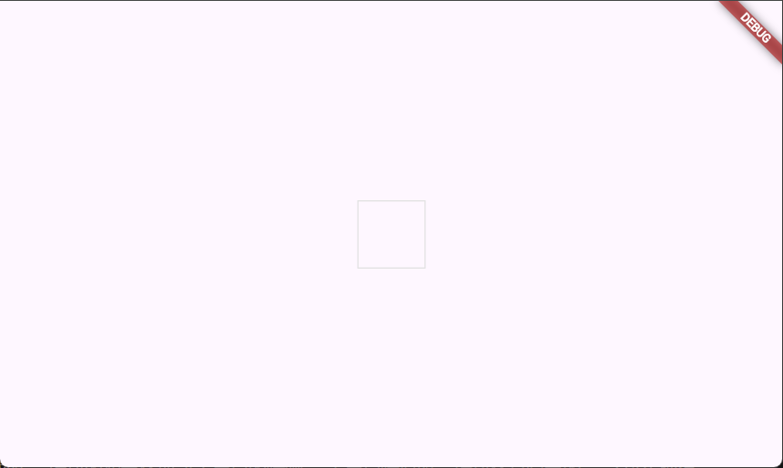
When this game is complete, the color of the tile will depend on the user's guess. The tile will be green when the user has guessed correctly, yellow when the letter is correct but the position is incorrect, and gray if the guess is wrong in both respects.
当这个游戏完成时, 砖块的颜色将取决于用户的猜测。 当用户猜对时,砖块将是绿色的。 字母正确但位置错误时显示黄色,和 两者都错误时显示灰色。
The following figure shows all three possibilities.
下图显示了所有三种可能性。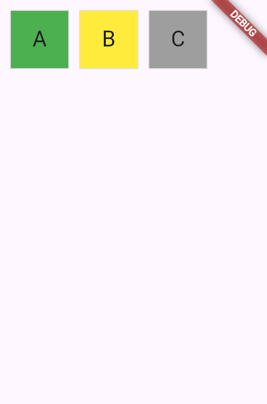
To achieve this in UI, use a switch expression to set the
colorof theBoxDecoration.
要在 UI 中实现这一点,请使用switch 表达式块来设置 color 的 BoxDecoration 。
class Tile extends StatelessWidget {
  const Tile(this.letter, this.hitType, {super.key});

  final String letter;
  final HitType hitType;

  @override
  Widget build(BuildContext context) {
    return Container(
      width: 60,
      height: 60,
      decoration: BoxDecoration(
        border: Border.all(color: Colors.grey.shade300),
        color: switch (hitType) {
          HitType.hit => Colors.green,
          HitType.partial => Colors.yellow,
          HitType.miss => Colors.grey,
          _ => Colors.white,
        },
        // TODO: add children
      ),
    );
  }
}
子组件 Child widgets
Finally, add the
CenterandTextwidgets to theContainer.childproperty.
最后,将 Center 和 Text 小部件添加到 Container.child 属性中。
Most widgets in the Flutter SDK have a
childorchildrenproperty that's meant to be passed a widget or a list of widgets, respectively. It's the best practice to use the same naming convention in your own custom widgets.
Flutter SDK 中的大多数小部件都有一个 child 或 children 属性,分别用于传递一个小部件或一组小部件。在自己的自定义小部件中使用相同的命名约定是最好的做法。
class Tile extends StatelessWidget {
  const Tile(this.letter, this.hitType, {super.key});

  final String letter;
  final HitType hitType;

  @override
  Widget build(BuildContext context) {
    return Container(
      width: 60,
      height: 60,
      decoration: BoxDecoration(
        border: Border.all(color: Colors.grey.shade300),
        color: switch (hitType) {
          HitType.hit => Colors.green,
          HitType.partial => Colors.yellow,
          HitType.miss => Colors.grey,
          _ => Colors.white,
        },
      ),
      child: Center(
        child: Text(
          letter.toUpperCase(),
          style: Theme.of(context).textTheme.titleLarge,
        ),
      ),
    );
  }
}
Hot reload and a green box appears. To toggle the color, update and hot reload the
HitTypepassed into theTileyou created:
热重载后会出现一个绿色框。要切换颜色,请更新并热重载你创建的 传入Title的HitType的值

// main.dart line ~16
// green
Tile('A', HitType.hit);
// grey
Tile('A', HitType.miss);
// yellow
Tile('A', HitType.partial);
Soon, this small box will be one of many widgets on the screen. In the next lesson, you'll start building the game grid itself.
很快,这个小方块将成为屏幕上许多小部件之一。在下一章节中,你将开始构建游戏网格本身。
测测你的梦 Test your self
Flutter组件的build方法必须应该返回什么
What must every Flutter widget's
buildmethod return?
Another widget.The
buildmethod always returns another widget, which forms part of the widget tree.
哪个对象用于向容器中添加布局、背景颜色和阴影
Which object is used to add decorations like borders, background colors, and shadows to a Container?
BoxDecorationBoxDecoration can add borders, background colors, gradients, shadows, and more to a Container.
BoxDecoration 可以给 Container 添加边框、背景颜色、渐变、阴影等效果。
布局Widget
Given that Flutter is a UI toolkit, you'll spend a lot of time creating layouts with Flutter widgets.
由于 Flutter 是一个 UI 工具包,您将花费大量时间使用 Flutter 小部件创建布局。
In this section, you'll learn how to build layouts with some of the most common layout widgets. This includes high-level widgets like
ScaffoldandAppBar, which lay out the structure of a screen, as well as lower-level widgets likeColumnorRowthat lay out widgets vertically or horizontally.
在本节中,您将学习如何使用一些最常见的布局小部件构建布局。这包括像 Scaffold 和 AppBar 这样的高级小部件,它们布置屏幕的结构,以及像 Column 或 Row 这样较低级别的小部件,它们垂直或水平布置小部件。
Scaffold与AppBar
Mobile applications often have a bar at the top called an "app bar" that can display a title, navigation controls, and/or actions.
移动应用程序通常在顶部有一个称为应用栏的区域,用于显示标题、导航控件和可用的操作
The simplest way to add an app bar to your app is by using two widgets:
ScaffoldandAppBar.
将应用栏添加到您的应用中最简单的方法是使用两个部件: Scaffold 和 AppBar 。
Scaffoldis a convenience widget that provides a Material-style page layout, making it simple to add an app bar, drawer, navigation bar, and more to a page of your app.AppBaris, of course, the app bar.
Scaffold 是一个便捷小部件,提供 Material 风格的页面布局,使添加应用栏、抽屉、导航栏等到应用的页面变得简单。 AppBar 当然就是应用栏。
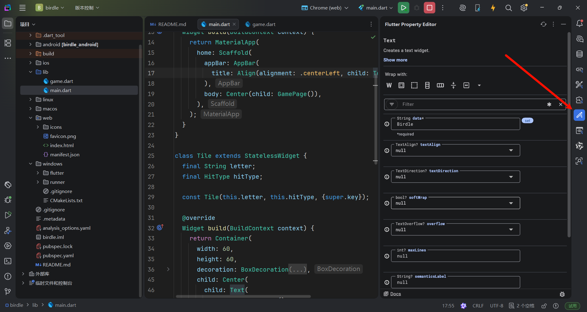
The code generated from the
flutter create --emptycommand already contains anAppBarwidget and aScaffoldwidget. The following code updates it to use an additional layout widget:Align. This positions the title to the left, which would be centered by default. TheTextwidget contains the title itself.
flutter create --empty 创建的项目中已经包含一个 AppBar 小部件和一个 Scaffold 小部件。接下来的代码会将其更新为使用额外的布局小部件: Align ,这会将标题定位到左侧,而默认情况下标题居中。 Text 小部件包含标题本身。
Modify the
Scaffoldwithin yourMainAppwidget'sbuildmethod.
在您的 MainApp 小部件的 build 方法中修改 Scaffold 。
class MainApp extends StatelessWidget {
  const MainApp({super.key});

  @override
  Widget build(BuildContext context) {
    return MaterialApp(
      home: Scaffold(
        appBar: AppBar(
          title: Align(
            alignment: Alignment.centerLeft,
            child: Text('Birdle'),
          ),
        ),
        body: Center(child: Text('Hello World!')),
      ),
    );
  }
}
Passing an enum or static property directly (like
Alignment.centerLeft) can also be shortened using Dart's dot shorthands syntax, which you can read more about on both the official Dart documentation and the Flutter shorthands overview.
直接传递枚举或静态属性(如 Alignment.centerLeft )也可以使用 Dart 的点简写语法来缩短,你可以在官方 Dart 文档和 Flutter 简写概述中了解更多信息。
dor-shorthand 点简写语法
The dot shorthands feature allows you to omit the explicit type when accessing static members, constructors, or enum values, provided the compiler can infer the type from the surrounding context.
点简写功能允许您在访问静态成员、构造函数或枚举值时省略显式类型,前提是编译器能够从周围上下文中推断类型。
注
使用短点访问语法/点简写语法的版本:
class MainApp extends StatelessWidget {
  const MainApp({super.key});

  @override
  Widget build(BuildContext context) {
    return MaterialApp(
      home: Scaffold(
        appBar: AppBar(
          title: Align(alignment: .centerLeft, child: Text("Birdle")),
        ),
        body: Center(child: Text("Hello World")),
      ),
    );
  }
}
现在的组件树 An updated widget tree
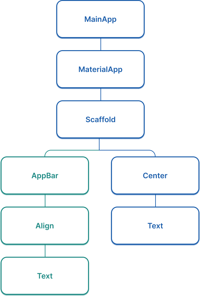
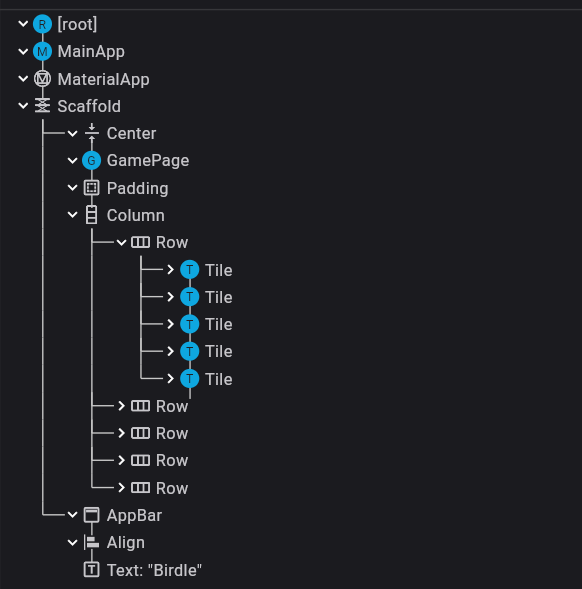
Considering your app's widget tree gets more important as your app grows. At this point, there's a "branch" in the widget tree for the first time, and it now looks like the following figure:
随着你的应用增长,组件树对你的应用来说变得越来越重要。 此时,组件树中第一次出现了一个“分支”。 现在它看起来如下所示:
为游戏页面布局创建一个组件 Create a widget for the game page layout
Add the following code for a new widget, called
GamePage, to yourmain.dartfile. This widget will eventually display the UI elements needed for the game itself.
在main.dart文件中添加一个新的组件,名为GamePage。该组件将用于显示必需的UI元素
class GamePage extends StatelessWidget {
  GamePage({super.key});
  // This object is part of the game.dart file.
  // It manages wordle logic, and is outside the scope of this tutorial.
  final Game _game = Game();

  @override
  Widget build(BuildContext context) {
    // TODO: Replace with screen contents
    return Container();
  }
}
Then update your
MainPagewidget to create and display aGamePagewidget instead of "Hello World!".
然后更新MainPage组件,以创建并渲染一个GamePage组件,而不再是Hello World文本
class MainApp extends StatelessWidget {
  const MainApp({super.key});

  @override
  Widget build(BuildContext context) {
    return MaterialApp(
      home: Scaffold(
        appBar: AppBar(
          title: const Align(
            alignment: Alignment.centerLeft,
            child: Text('Birdle'),
          ),
        ),
        body: Center(child: GamePage()),
      ),
    );
  }
}
使用行列布局组织元素 Arrange widgets with Column and Row
The
GamePagelayout contains the grid of tiles that display a user's guesses.
GamePage 布局包含(记录用户猜测状态的)单词网格
There are a number of ways you can build this layout. The simplest is with the
ColumnandRowwidgets. Each row contains five tiles that represent the five letters in a guess, with five rows total. So you'll need a singleColumnwith fiveRowwidgets as children, where each row contains five children.
你可以用多种方式构建这个布局。最简单的方法是使用 Column 和 Row 组件。一行有五个字母,一共有五行。因此,你需要一个 Column 组件,作为五个 Row 组件的父组件,其中每一行包含五个子组件。
To get started, replace the
ContainerinGamePage.buildwith aPaddingwidget with aColumnwidget as its child:
开始时,将 GamePage.build 中的 Container 替换为一个 Padding 组件,该组件包含一个 Column 组件作为其子组件:
class GamePage extends StatelessWidget {
  GamePage({super.key});
  // This manages game logic, and is out of scope for this lesson.
  final Game _game = Game();

  @override
  Widget build(BuildContext context) {
    return Padding(
      padding: const EdgeInsets.all(8.0),
      child: Column(
        spacing: 5.0,
        children: [
          // Add children next.
        ],
      ),
    );
  }
}
The
spacingproperty puts five pixels between each element on the main axis.
spacing属性用于在主轴的各个元素之间插入五个像素
Within
Column.children, for each element in the_game.guesseslist, add aRowwidget as a child.
在 Column.children 内部,对于 _game.guesses 列表中的每个元素都会添加一个 Row 组件作为子组件。
注
This
guesseslist is a fixed-size list, starting with five elements, one for each potential guess. The list will always contain exactly five elements, and therefore will always render five rows.
这个 guesses 列表是一个固定大小的列表,起始时有五个元素,每个元素对应一个可能的猜测。该列表始终包含恰好五个元素,因此始终会渲染五行。
class GamePage extends StatelessWidget {
  GamePage({super.key});
  // This manages game logic, and is out of scope for this lesson.
  final Game _game = Game();

  @override
  Widget build(BuildContext context) {
    return Padding(
      padding: const EdgeInsets.all(8.0),
      child: Column(
        spacing: 5.0,
        children: [
          for (final guess in _game.guesses)
            Row(
              spacing: 5.0,
              children: [
                // We'll add the tiles here later.
              ],
            ),
        ],
      ),
    );
  }
}
注
此处使用了集合内展开语法
集合内for循环不可以写大括号来显式隔开控制流
The
forloop in thechildrenlist is called a collection for element, a Dart syntax that allows you to iteratively add items to a collection when it is built at runtime. This syntactic sugar makes it easier for you to work with collections of widgets, providing a declarative alternative to the following:
在 children 列表中的 for 循环被称为元素集合,这是一种 Dart 语法,允许你在运行时构建集合时迭代添加项到集合中。这种语法糖使你更容易处理小部件集合,尽管也有如下函数式(直译是声明式)替代方案:
[..._game.guesses.map((guess) => Row(/* ... */))],In this case, it adds five
Rowwidgets to the column, one for each guess on theGameobject.
在本例中,我们向列中添加了五个 Row 组件,每个 Game 对象中的一个字母对应Row中的一个组件。
现在的组件树
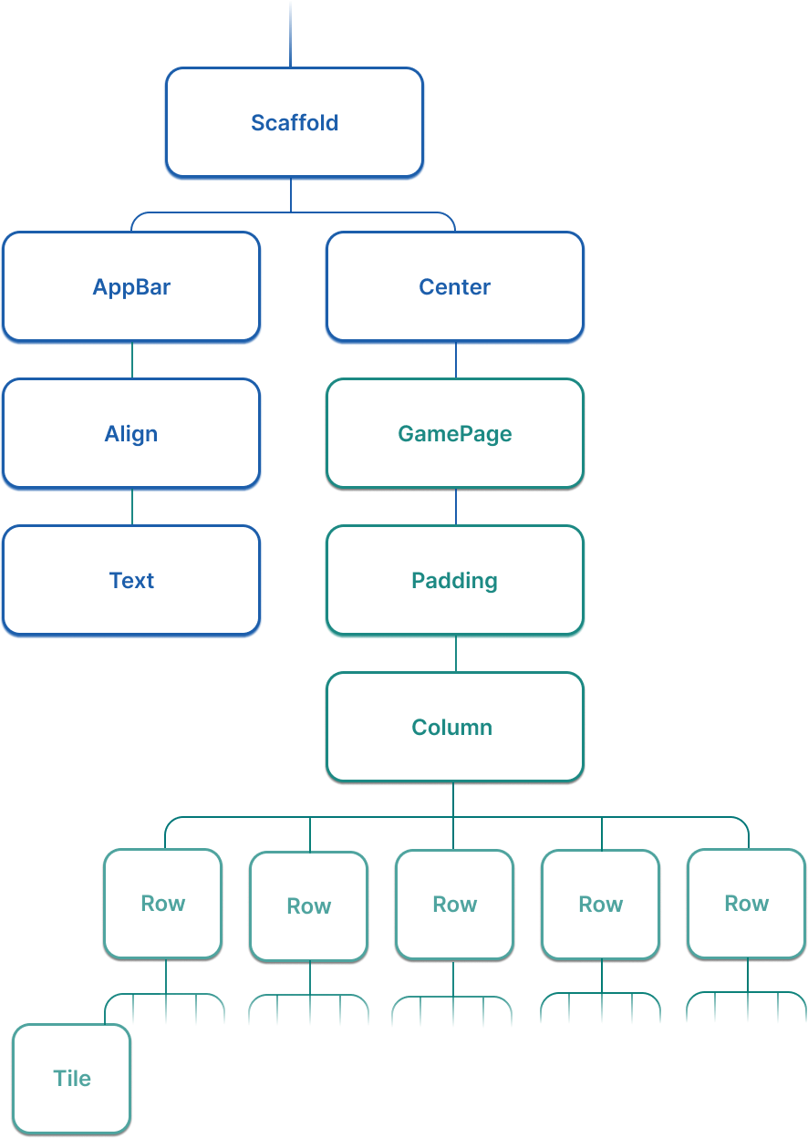
The widget tree for this app has expanded significantly in this lesson. Now, it looks more like the following (abridged) figure:
这个应用程序的部件树在这一课中有了显著扩展。 现在,它看起来更像是下面的(节选)图形:
挑战
Add a
Tileto each row for each letter allowed in the guess. Theguessvariable in the loop is a record with the type({String char, HitType type}).
为每个猜测中允许的每个字母,在每一行中添加一个 Tile 。循环中的 guess 变量是一个类型为 ({String char, HitType type}) 的记录。
class GamePage extends StatelessWidget {
  GamePage({super.key});

  // This manages game logic, and is out of scope for this lesson.
  final Game _game = Game();

  @override
  Widget build(BuildContext context) {
    return Padding(
      padding: const EdgeInsets.all(8.0),
      child: Column(
        spacing: 5.0,
        children: [
          for (final guess in _game.guesses)
            Row(
              spacing: 5.0,
              children: [
                for (final letter in guess) Tile(letter.char, letter.type),
              ],
            ),
        ],
      ),
    );
  }
}
测测你的梦 Test yourself
行组件和列组件的区别是什么
What is the primary difference between a Column and a Row widget?
Column arranges children vertically; Row arranges children horizontally.Column lays out its children along the vertical axis, while Row uses the horizontal axis.
Scaffold组件提供了什么功能
What does the Scaffold widget provide in a Flutter app?
A Material-style page layout with slots for app bar, body, drawer, and more.Scaffold is a convenience widget that provides a standard Material page structure.
开发者工具 DevTools
引言 Introduction
As your Flutter app grows in complexity, it becomes more important to understand how each of the widget properties affects the UI. The Dart and Flutter DevTools provide you with two particularly useful features: the widget inspector and the property editor.
随着您的 Flutter 应用程序变得越来越复杂,理解每个组件属性如何影响 UI 变得更加重要。Dart 和 Flutter DevTools 为您提供了两个特别有用的功能:组件检查器和属性编辑器
下面是教你如何打开调试器的,这里就不搬运了
组件检查器 The widget inspector
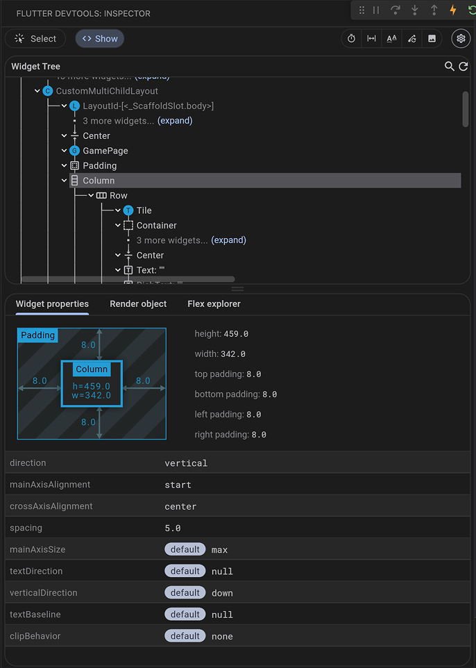
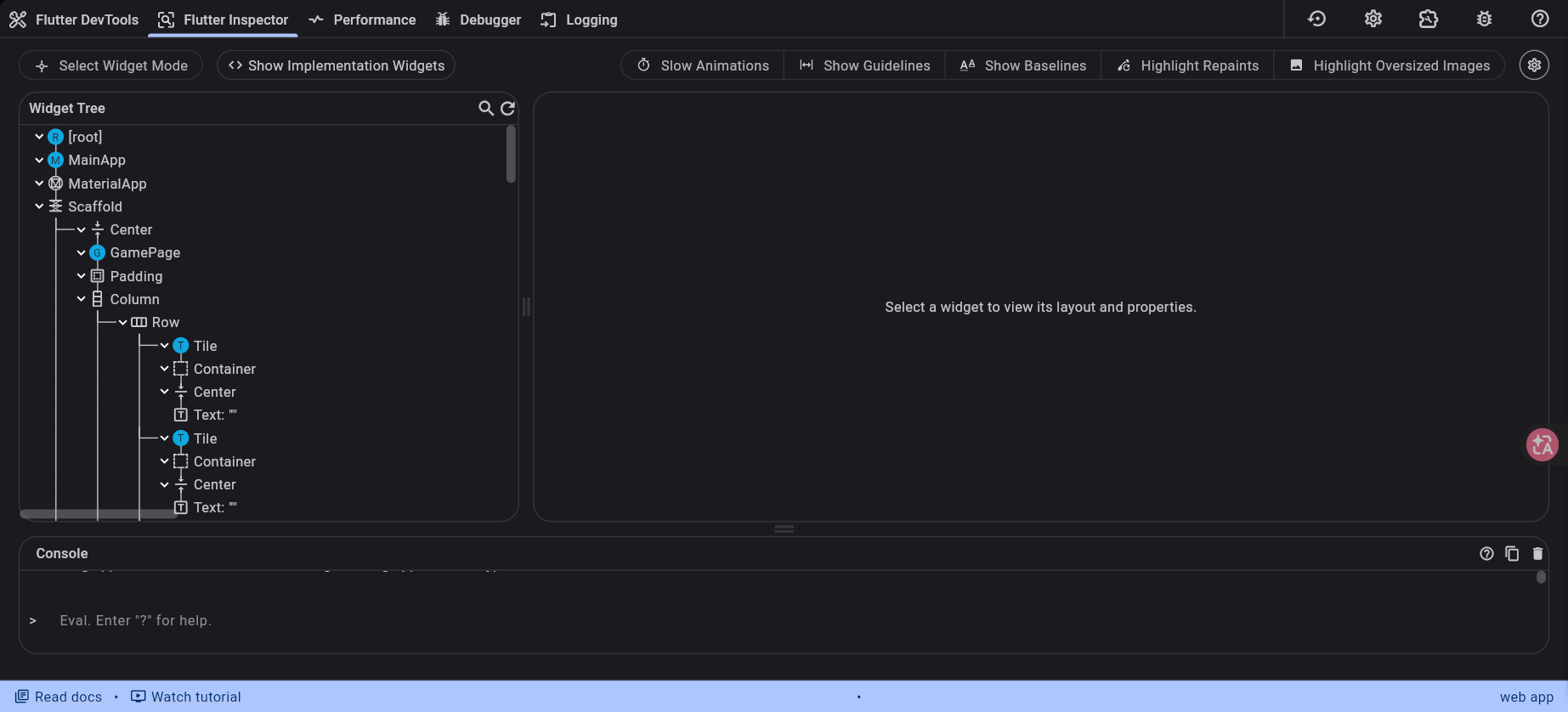
The widget inspector allows you to visualize and explore your widget tree. It helps you understand the layout of your UI and identifies which widgets are responsible for different parts of the screen. Running against the app you've built so far, the inspector looks like this:
组件检查器允许您可视化并探索您的组件树。 它帮助您理解您的 UI 布局,并 确定哪些组件负责屏幕的不同部分。 在您已构建的应用程序上运行时,检查器看起来像这样:
Consider the
GamePagewidget you created in this section:
回到之前创建的GamePage组件:
class GamePage extends StatelessWidget {
  GamePage({super.key});

  final Game _game = Game();

  @override
  Widget build(BuildContext context) {
    return Padding(
      padding: const EdgeInsets.all(8.0),
      child: Column(
        spacing: 5.0,
        children: [
          for (var guess in _game.guesses)
            Row(
              spacing: 5.0,
              children: [
                for (var letter in guess) Tile(letter.char, letter.type)
              ]
            ),
        ],
      ),
    );
  }
}
And how it's used in
MainApp:
以及它在 MainApp 中的使用方式:
class MainApp extends StatelessWidget {
  const MainApp({super.key});

  @override
  Widget build(BuildContext context) {
    return MaterialApp(
      home: Scaffold(
        body: Center(child: GamePage()),
      ),
    );
  }
}
In the widget inspector, you should see a tree of exactly the same widgets that are in your code:
MaterialAppas the root, withScaffoldas itshome, anAppBaras itsappBar, and so on down the entire tree to theRowwidgets withTilechildren. You can select any widget in the tree to see its properties and even jump to its source code in your IDE.
在组件检查器中,你应该看到与你的代码中完全相同的组件树:以 MaterialApp 为根节点, Scaffold 作为其 home ,一个 AppBar 作为其 appBar ,等等,整个树状结构一直延伸到具有 Tile 个子节点的 Row 组件。你可以选择树中的任何组件来查看其属性,甚至可以跳转到其在 IDE 中的源代码。
注意
Goland + Flutter插件可能不支持跳转到源代码
在Debugger中查看源代码
调试布局 Debugging layout issues
The widget inspector is perhaps most useful for debugging layout issues.
组件inspector可能是调试布局最有用的工具
In certain situations, a widget's constraints are unbounded, or infinite. This means that either the maximum width or the maximum height is set to
double.infinity. A widget that tries to be as big as possible won't function usefully when given an unbounded constraint and, in debug mode, throws an exception.
在某些情况下,一个组件的约束是无界的,或无限的。这意味着最大宽度或最大高度被设置为 double.infinity 。一个试图尽可能大的组件在给定无界约束时不会有效工作,并且在调试模式下会抛出异常。
The most common case where a render box ends up with an unbounded constraint is within a flex box widget (
RoworColumn), and within a scrollable region, such as aListVieworScrollViewsubclasses.
一个渲染框最终得到无界约束的最常见情况是在 flexbox 组件( Row 或 Column )内部,以及在可滚动区域 例如 ListView 或 ScrollView 的子类 内部。
ListView, for example, tries to expand to fit the space available in its cross-direction. Such as if it's a vertically scrolling block that tries to be as wide as its parent. If you nest a vertically scrollingListViewinside a horizontally scrollingListView, the inner list tries to be as wide as possible, which is infinitely wide, since the outer one is scrollable in that direction.
ListView 会试图扩展以适应其交叉方向上的可用空间,一个垂直的滚动块就会尝试继承父级组件的宽度。如果你将一个垂直滚动的 ListView 嵌套在一个水平滚动的 ListView 内部,里面那个列表会尽可能宽,并且会变得无限宽,因为外部组件在水平方向上是可滚动的。
Perhaps the most common error you'll run into while building a Flutter application is due to incorrectly using layout widgets. This error is referred to as the "unbounded constraints" error.
在构建Flutter程序时最常遇到的运行时错误由不正确使用布局组件 导致。 此错误被称为无界约束错误。
Watch the following video to get an understanding of how to spot and resolve this issue.
观看视频以了解如何 识别和解决此问题。
注
视频大意是尽量显式声明不定大小组件(比如一个可以无限高的ListView)的布局位置,比如用Expand或SizedBox(定高)来限制不定大小组件的渲染边界
属性编辑器 The property editor
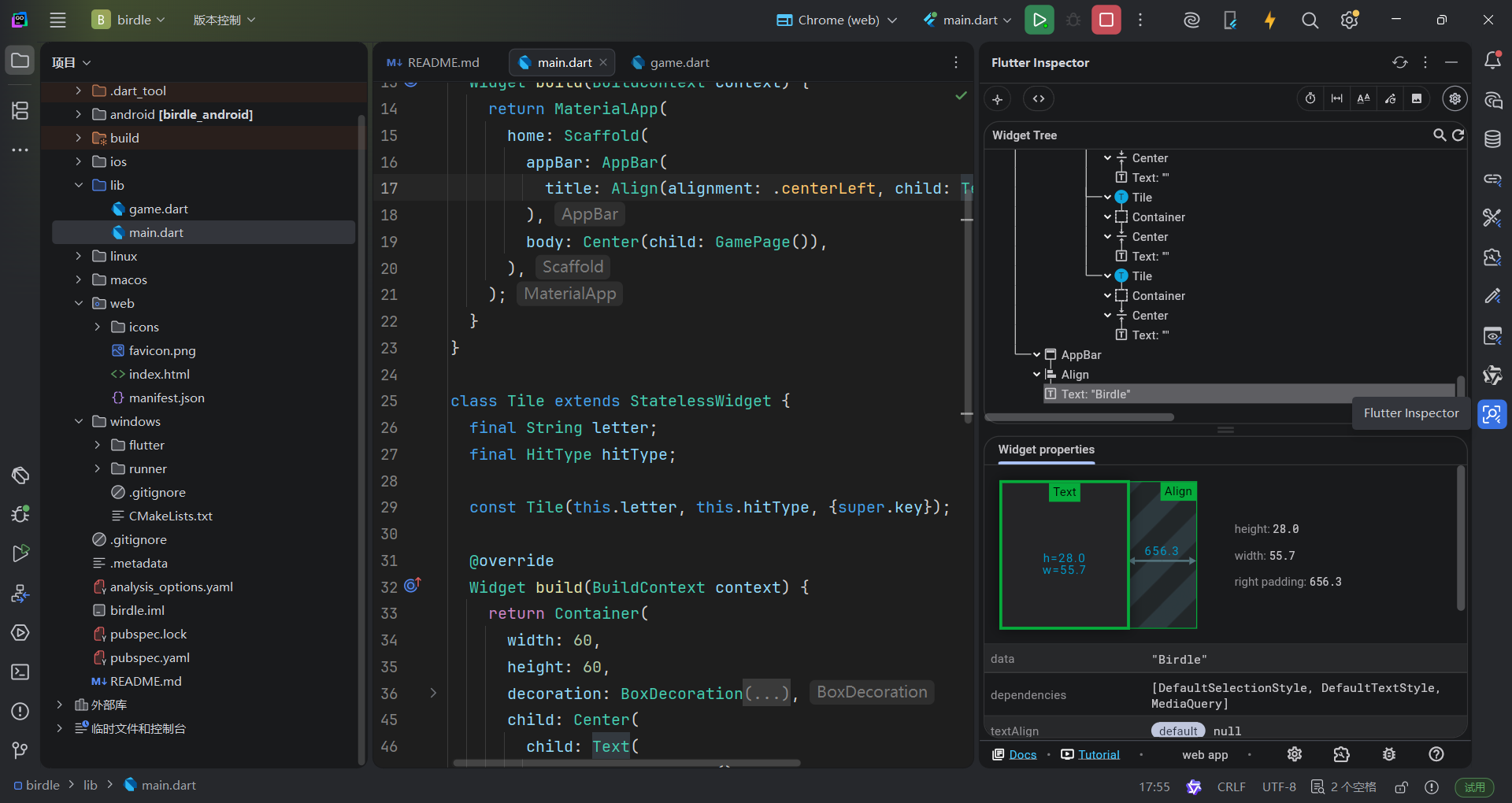
When you select a widget in the widget inspector, the property editor displays all the properties of that selected widget. This is a powerful tool for understanding why a widget looks the way it does and for experimenting with property value changes in real-time.
当你在部件检查器中选择一个部件时, 属性编辑器会显示该选定部件的所有属性。 这是一个强大的工具,用于理解部件为何看起来是这个样子,以及 用于实时尝试更改属性值。
Look at the
Tilewidget'sbuildmethod from earlier:
看看之前提到的 Tile 组件的 build 方法:
class Tile extends StatelessWidget {
  const Tile(this.letter, this.hitType, {super.key});

  final String letter;
  final HitType hitType;

  @override
  Widget build(BuildContext context) {
    return Container(
      width: 60,
      height: 60,
      decoration: BoxDecoration(
        border: Border.all(color: Colors.grey.shade300),
        color: switch (hitType) {
          HitType.hit => Colors.green,
          HitType.partial => Colors.yellow,
          HitType.miss => Colors.grey,
          _ => Colors.white,
        },
      ),
    );
  }
}
If you select the
Containerwidget inside theTilein the widget inspector, the property editor shows itswidth(60),height(60), and thedecorationproperty. You could then expand theBoxDecorationto see theborderandcolorproperties.
如果在组件检查器中选中 Tile 内的 Container 组件,属性编辑器会显示其 width (60)、 height (60) 和 decoration 属性。然后你可以展开 BoxDecoration 来查看 border 和 color 属性。
For many properties, you can even modify their values directly within the property editor. For example, to quickly test how a different
widthorheightwould look for yourContainerin theTilewidget, change the numerical value in the property editor. The tool writes this update directly back to your.dartsource file on disk, allowing you to instantly view the visual update on your running app upon saving or triggering a hot reload. This allows for rapid iteration on UI design.
对于许多属性,你甚至可以直接在属性编辑器中修改它们的值。例如,要快速测试不同的 width 或 height 在 Container 组件中的外观,可以在属性编辑器中更改数值。该工具会将此更新直接写回你的 .dart 源文件,让你在保存或触发热重载时立即在运行的应用程序中查看视觉更新。这允许快速迭代 UI 设计。
做个测试 Test yourself
无边界错误的常见原因是什么
What is a common cause of "unbounded constraints" errors in Flutter?
Placing a widget that tries to expand infinitely inside a scrollable or flex container without proper constraints.Widgets like ListView inside a Row, or nested scrollables, can receive infinite constraints and fail.
将试图无限扩展的组件放置在可滚动或弹性容器中,而没有适当的约束。
组件Inspector可以做什么
What can you do with the Widget Inspector in Flutter DevTools?
Visualize your widget tree, select widgets to view their properties, and jump to source code.The Widget Inspector lets you explore your app's structure, inspect widget properties, and navigate to the corresponding source code.
处理用户输入
引言 Introduction
The app will display the user's guesses in the
Tilewidgets, but it needs a way for the user to input those guesses. In this lesson, build that functionality with two interaction widgets:TextFieldandIconButton.
应用将在 Tile 组件中显示用户的猜测,但它需要一个方式让用户输入这些猜测。在本课中,使用两个交互组件: TextField 和 IconButton 来构建该功能。
实现回调函数 Implement the callback functions
To allow users to type in their guesses, you'll create a dedicated widget named
GuessInput. First, create the basic structure for yourGuessInputwidget that requires a callback function as an argument. Name the callback functiononSubmitGuess.
为了允许用户输入他们的猜测,您将创建一个名为 GuessInput 的专用组件。首先,创建您的 GuessInput 组件的基本结构,该组件需要一个回调函数作为参数。将回调函数命名为 onSubmitGuess 。
Add the following code to your
main.dartfile.
将以下代码添加到您的 main.dart 文件中。
class GuessInput extends StatelessWidget {
  GuessInput({super.key, required this.onSubmitGuess});

  final void Function(String) onSubmitGuess;

  @override
  Widget build(BuildContext context) {
    // You'll build the UI in the next steps.
    return Container(); // Placeholder
  }
}
The line
final void Function(String) onSubmitGuess;declares afinalmember of the class calledonSubmitGuessthat has the typevoid Function(String). This function takes a singleStringargument (the user's guess) and doesn't return any value (denoted byvoid).
final void Function(String) onSubmitGuess 声明了一个名为 onSubmitGuess 的final属性,其类型为 void Function(String) 。函数接受一个 String 参数(用户的猜测),并且不返回任何值(由 void 表示)
This callback tells us that the logic that actually handles the user's guess will be written elsewhere. It's a good practice for interactive widgets to use callback functions to keep the widget that handles interactions reusable and decoupled from any specific functionality.
这个回调告诉我们,实际处理用户猜测的逻辑将写在别处。对于交互式小部件,使用回调函数是一种良好的实践,这样可以保持处理交互的小部件的可重用性和与任何特定功能的解耦。
By the end of this lesson, the passed-in
onSubmitGuessfunction is called when a user enters a guess. First, you'll need to build the visual parts of this widget. This is what the widget will look like.
在本节结束时,当用户输入猜测时,传入的 onSubmitGuess 函数会被调用。首先,你需要构建这个小部件的视觉部分。这就是小部件的外观。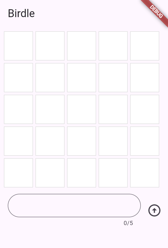
TextField 文本域组件 TextField Widget
Given that the text field and button are displayed side-by-side, create them as a
Rowwidget. Replace theContainerplaceholder in yourbuildmethod with aRowcontaining anExpandedTextField:
接下来使用Row组件并排放置TextField和按钮。在您的 build 方法中替换 Container 占位符为包含 Expanded TextField 的 Row :
class GuessInput extends StatelessWidget {
  GuessInput({super.key, required this.onSubmitGuess});

  final void Function(String) onSubmitGuess;

  @override
  Widget build(BuildContext context) {
    return Row(
      children: [
        Expanded(
          child: Padding(
            padding: const EdgeInsets.all(8.0),
            child: TextField(
              maxLength: 5,
              decoration: InputDecoration(
                border: OutlineInputBorder(
                  borderRadius: BorderRadius.all(Radius.circular(35)),
                ),
              ),
            ),
          ),
        ),
      ],
    );
  }
}
注
此时GameInput还没有加入到MainApp的build方法中,所以不会显示出来
You have seen some of these widgets in previous lessons:
RowandPadding. New, though, is theExpandedwidget. When a child of aRow(orColumn) is wrapped inExpanded, it tells that child to fill all the available space along the main axis (horizontal forRow, vertical forColumn) that hasn't been taken by other children. This makes theTextFieldstretch to take up all the space except what's taken by other widgets in the row.
您在之前的章节中已经见过 Row 和 Padding 两个组件。这一次引入了 Expanded 部件。当一个 Row (或 Column )的子元素被包裹在 Expanded 中时,它会告诉那个子元素填充沿着主轴(对于 Row 是水平方向,对于 Column 是垂直方向)的所有可用空间,这些空间没有被其他子元素占用。这使得 TextField 伸展以占据所有空间,除了行中其他小部件占用的空间。
The
TextFieldwidget is also new in this lesson and is the star of the show. This is the basic Flutter widget for text input.
本节新引入的 TextField 组件也是本节的明星。它是 Flutter 中用于文本输入的基本组件。
Thus far,
TextFieldhas the following configuration.
到目前为止, TextField 具有以下配置:
- It's decorated with a rounded border. Notice that the decoration configuration is very similar to how a
Containerand boxes are decorated.
圆角边框装饰;注意装饰配置与Container以及Box的装饰方式非常相似。 - Its
maxLengthproperty is set to 5 because the game only allows guesses of 5-letter words.
它的maxLength属性设置为 5,因为游戏只允许猜测 5 个字母的单词
使用TextEditingController处理文本 Handle text with TextEditingController
Next, you need a way to manage the text that the user types into the input field. For this, use a
TextEditingController.
接下来你需要处理用户在输入框中输入的文本,这里我们使用TextEditingController组件
class GuessInput extends StatelessWidget {
  GuessInput({super.key, required this.onSubmitGuess});

  final void Function(String) onSubmitGuess;

  // NEW
  final TextEditingController _textEditingController = TextEditingController();

  @override
  Widget build(BuildContext context) {
    return Row(
      children: [
        Expanded(
          child: Padding(
            padding: const EdgeInsets.all(8.0),
            child: TextField(
              maxLength: 5,
              decoration: InputDecoration(
                border: OutlineInputBorder(
                  borderRadius: BorderRadius.all(Radius.circular(35)),
                ),
              ),
            ),
          ),
        ),
        //
      ],
    );
  }
}
A
TextEditingControlleris used to read, clear, and modify the text in aTextField. To use it, pass it into theTextField.
TextEditingController控件用于读取、清空和修改TextField组件中的文本。要使用这个控件,请传递给TextField
class GuessInput extends StatelessWidget {
  GuessInput({super.key, required this.onSubmitGuess});

  final void Function(String) onSubmitGuess;

  final TextEditingController _textEditingController = TextEditingController();

  @override
  Widget build(BuildContext context) {
    return Row(
      children: [
        Expanded(
          child: Padding(
            padding: const EdgeInsets.all(8.0),
            child: TextField(
              maxLength: 5,
              decoration: const InputDecoration(
                border: OutlineInputBorder(
                  borderRadius: BorderRadius.all(Radius.circular(35)),
                ),
              ),
              controller: _textEditingController, // NEW
            ),
          ),
        ),
      ],
    );
  }
}
Now, when a user inputs text, you can capture it with the
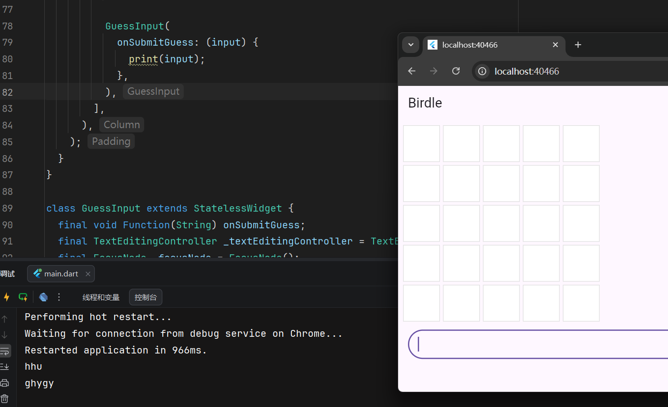
_textEditingController, but you'll need to know when to capture it. The simplest way to react to input is by using theTextField.onSubmittedargument. This argument accepts a callback, and the callback is triggered whenever the user presses the "Enter" key on the keyboard while the text field has focus.
在当用户输入文本时,您可以使用 _textEditingController 捕获它,但您需要知道何时捕获它。对输入做出反应最简单的方法是使用 TextField.onSubmitted 参数。该参数接受一个回调函数,在文本字段获得焦点时按下键盘上的“Enter”键,回调就会被触发。
For now, ensure that this works by adding the following callback to
TextField.onSubmitted:
目前,请确保通过向 TextField.onSubmitted 添加以下回调使其正常工作:
class GuessInput extends StatelessWidget {
  GuessInput({super.key, required this.onSubmitGuess});

  final void Function(String) onSubmitGuess;

  final TextEditingController _textEditingController = TextEditingController();

  @override
  Widget build(BuildContext context) {
    return Row(
      children: [
        Expanded(
          child: Padding(
            padding: const EdgeInsets.all(8.0),
            child: TextField(
              maxLength: 5,
              decoration: const InputDecoration(
                border: OutlineInputBorder(
                  borderRadius: BorderRadius.all(Radius.circular(35)),
                ),
              ),
              controller: _textEditingController,
              onSubmitted: (input) {
                // NEW
                print(_textEditingController.text); // Temporary
              },
            ),
          ),
        ),
      ],
    );
  }
}
In this case, you could print the
inputpassed to theonSubmittedcallback directly, but a better user experience clears the text after each guess: You need aTextEditingControllerto do that. Update the code as follows:
在这种情况下,你可以直接打印传递给 onSubmitted 回调的 input ,但更好的用户体验是在每次猜测后清除文本:你需要一个 TextEditingController 来实现这一点。请按以下方式更新代码:
class GuessInput extends StatelessWidget {
  GuessInput({super.key, required this.onSubmitGuess});

  final void Function(String) onSubmitGuess;

  final TextEditingController _textEditingController = TextEditingController();

  @override
  Widget build(BuildContext context) {
    return Row(
      children: [
        Expanded(
          child: Padding(
            padding: const EdgeInsets.all(8.0),
            child: TextField(
              maxLength: 5,
              decoration: const InputDecoration(
                border: OutlineInputBorder(
                  borderRadius: BorderRadius.all(Radius.circular(35)),
                ),
              ),
              controller: _textEditingController,
              onSubmitted: (_) {
                // UPDATED
                print(_textEditingController.text); // Temporary
                _textEditingController.clear(); // NEW
              },
            ),
          ),
        ),
      ],
    );
  }
}
注
In Dart, it's good practice to use the
_wildcard to hide the input to a function that'll never be used. The preceding example does so.
在 Dart 中,使用 _ 通配符来隐藏一个永远不会被使用的函数的输入是一种良好的实践。前面的示例就是这样做的
确切地说, 是以_开头的symbol永远不会被导出
获取输入焦点 Gain input focus
Often, you want a specific input or widget to automatically gain focus without the user taking action. In this app, for example, the only thing a user can do is enter a guess, so the
TextFieldshould be focused automatically when the app launches. And after the user enters a guess, the focus should stay in theTextFieldso they can enter their next guess.
通常,您希望某个特定的输入或组件能够自动获得焦点,而无需用户进行任何操作。例如,在这个应用程序中,用户唯一能做的就是输入一个猜测,因此当应用程序启动时, TextField 应该自动获得焦点。并且,在用户输入一个猜测后,焦点应该保持在 TextField 上,以便他们输入下一个猜测。
To resolve the first focus issue, set up the
autofocusproperty on theTextField.
要解决第一个问题,请在 TextField 上设置 autofocus 属性。
class GuessInput extends StatelessWidget {
  GuessInput({super.key, required this.onSubmitGuess});

  final void Function(String) onSubmitGuess;

  final TextEditingController _textEditingController = TextEditingController();

  @override
  Widget build(BuildContext context) {
    return Row(
      children: [
        Expanded(
          child: Padding(
            padding: const EdgeInsets.all(8.0),
            child: TextField(
              maxLength: 5,
              decoration: const InputDecoration(
                border: OutlineInputBorder(
                  borderRadius: BorderRadius.all(Radius.circular(35)),
                ),
              ),
              controller: _textEditingController,
              autofocus: true, // NEW
              onSubmitted: (input) {
                print(input); // Temporary
                _textEditingController.clear();
              },
            ),
          ),
        ),
      ],
    );
  }
}
The second issue requires you to use a
FocusNodeto manage the keyboard focus. You can useFocusNodeto request that aTextFieldgain focus, (making the keyboard appear on mobile), or to know when a field has focus.
第二个问题需要您使用 FocusNode 来管理键盘焦点。您可以使用 FocusNode 来请求一个 TextField 获得焦点(在移动设备上显示键盘),或了解一个字段何时获得焦点。
First, create a
FocusNodein theGuessInputclass:
首先,在 GuessInput 类中创建一个 FocusNode :
class GuessInput extends StatelessWidget {
  GuessInput({super.key, required this.onSubmitGuess});

  final void Function(String) onSubmitGuess;

  final TextEditingController _textEditingController = TextEditingController();

  final FocusNode _focusNode = FocusNode(); // NEW

  @override
  Widget build(BuildContext context) {
    // ...
    return Container();
  }
}
Then, use the
FocusNodeto request focus whenever theTextFieldis submitted after the controller is cleared:
然后,在控制器清除后,每当提交 TextField 时,使用 FocusNode 请求焦点:
class GuessInput extends StatelessWidget {
  GuessInput({super.key, required this.onSubmitGuess});

  final void Function(String) onSubmitGuess;

  final TextEditingController _textEditingController = TextEditingController();

  final FocusNode _focusNode = FocusNode();

  @override
  Widget build(BuildContext context) {
    return Row(
      children: [
        Expanded(
          child: Padding(
            padding: const EdgeInsets.all(8.0),
            child: TextField(
              maxLength: 5,
              decoration: const InputDecoration(
                border: OutlineInputBorder(
                  borderRadius: BorderRadius.all(Radius.circular(35)),
                ),
              ),
              controller: _textEditingController,
              autofocus: true,
              focusNode: _focusNode, // NEW
              onSubmitted: (input) {
                print(input); // Temporary
                _textEditingController.clear();
                _focusNode.requestFocus(); // NEW
              },
            ),
          ),
        ),
      ],
    );
  }
}
Now, when you press Enter after inputting text, you can continue typing.
现在,在输入文本后按 Enter ,您可以继续输入
处理输入 Use the input
Finally, you need to handle the text that the user enters. Recall that the constructor for
GuessInputrequires a callback calledonSubmitGuess. InGuessInput, you need to use that callback. Replace the
最后,你需要处理用户输入的文本。回想一下, GuessInput 的构造函数需要一个名为 onSubmitGuess 的回调函数。在 GuessInput 中,你需要使用那个回调函数。将 print 语句替换为对该函数的调用。
class GuessInput extends StatelessWidget {
  GuessInput({super.key, required this.onSubmitGuess});

  final void Function(String) onSubmitGuess;

  final TextEditingController _textEditingController = TextEditingController();

  final FocusNode _focusNode = FocusNode();

  @override
  Widget build(BuildContext context) {
    return Row(
      children: [
        Expanded(
          child: Padding(
            padding: const EdgeInsets.all(8.0),
            child: TextField(
              maxLength: 5,
              decoration: const InputDecoration(
                border: OutlineInputBorder(
                  borderRadius: BorderRadius.all(Radius.circular(35)),
                ),
              ),
              controller: _textEditingController,
              autofocus: true,
              focusNode: _focusNode,
              onSubmitted: (input) {
                onSubmitGuess(_textEditingController.text.trim());
                _textEditingController.clear();
                _focusNode.requestFocus();
              },
            ),
          ),
        ),
      ],
    );
  }
}
The remaining functionality is handled in the parent widget,
GamePage. In thebuildmethod of that class, under theRowwidgets in theColumnwidget's children, add theGuessInputwidget:
其余功能由父组件 GamePage 处理。在该类的 build 方法中,在 Column 组件的子组件中的 Row 组件下,添加 GuessInput 组件:
class GamePage extends StatelessWidget {
  GamePage({super.key});

  final Game _game = Game();

  @override
  Widget build(BuildContext context) {
    return Padding(
      padding: const EdgeInsets.all(8.0),
      child: Column(
        spacing: 5.0,
        children: [
          for (final guess in _game.guesses)
            Row(
              spacing: 5.0,
              children: [
                for (final letter in guess) Tile(letter.char, letter.type),
              ],
            ),
          GuessInput(
            onSubmitGuess: (guess) {
              // TODO, handle guess
              print(guess); // Temporary
            },
          ),
        ],
      ),
    );
  }
}
For the moment, this only prints the guess to prove that it's wired up correctly. Submitting the guess requires using the functionality of a
StatefulWidget, which you'll do in the next lesson.
目前,这仅打印猜测结果以证明其已正确上线。提交猜测需要使用 StatefulWidget 的功能,你将在下一节中完成
按钮组件 Buttons
To improve the UX on mobile and reflect well-known UI practices, there should also be a button that can submit the guess.
为了提升移动端的用户体验并遵循常见的 UI 实践, APP还应该有一个可以提交猜测的按钮
There are many button widgets built into Flutter, like
TextButton,ElevatedButton, and the button you'll use now:IconButton. All of these buttons (and many other interaction widgets) require two arguments (in addition to their optional arguments):
Flutter 内置了许多按钮组件,如 TextButton 、 ElevatedButton ,以及你现在将要使用的 IconButton。所有这些按钮(以及许多其他交互组件)都需要两个参数(除了它们的可选参数):
- A callback function passed to
onPressed.
传递给onPressed属性的回调函数 - A widget that makes up the content of the button (often
Textor anIcon)
按钮内容(通常是Text文本或Icon图标)
Add an icon button to the row widget's children list in the
GuessInputwidget, and give it anIconwidget to display. TheIconwidget requires configuration; in this case, thepaddingproperty sets the padding between the edge of the button and the icon it wraps to zero. This removes the default padding and makes the button smaller.
在 GuessInput 组件的行组件的子组件列表中添加一个图标按钮,并给它一个 Icon 组件来显示。 Icon 组件需要配置;在这种情况下, padding 属性将按钮边缘和它包装的图标之间的填充设置为 0。这移除了默认填充,使按钮更小
class GuessInput extends StatelessWidget {
  GuessInput({super.key, required this.onSubmitGuess});

  final void Function(String) onSubmitGuess;

  final TextEditingController _textEditingController = TextEditingController();
  final FocusNode _focusNode = FocusNode();

  @override
  Widget build(BuildContext context) {
    return Row(
      children: [
        Expanded(child: Container()),
        IconButton(
          padding: EdgeInsets.zero,
          icon: const Icon(Icons.arrow_circle_up),
          onPressed: null,
        ),
      ],
    );
  }
}
The
IconButton.onPressedcallback should look familiar:
IconButton.onPressed 回调应该很熟悉:
class GuessInput extends StatelessWidget {
  GuessInput({super.key, required this.onSubmitGuess});

  final void Function(String) onSubmitGuess;

  final TextEditingController _textEditingController = TextEditingController();
  final FocusNode _focusNode = FocusNode();

  @override
  Widget build(BuildContext context) {
    return Row(
      children: [
        Expanded(child: Container()),
        IconButton(
          padding: EdgeInsets.zero,
          icon: const Icon(Icons.arrow_circle_up),
          onPressed: () {
            onSubmitGuess(_textEditingController.text.trim());
            _textEditingController.clear();
            _focusNode.requestFocus();
          },
        ),
      ],
    );
  }
}
This method does the same as the
onSubmittedcallback on theTextField.
这个方法与 TextField 上的 onSubmitted 回调做的是同样的操作
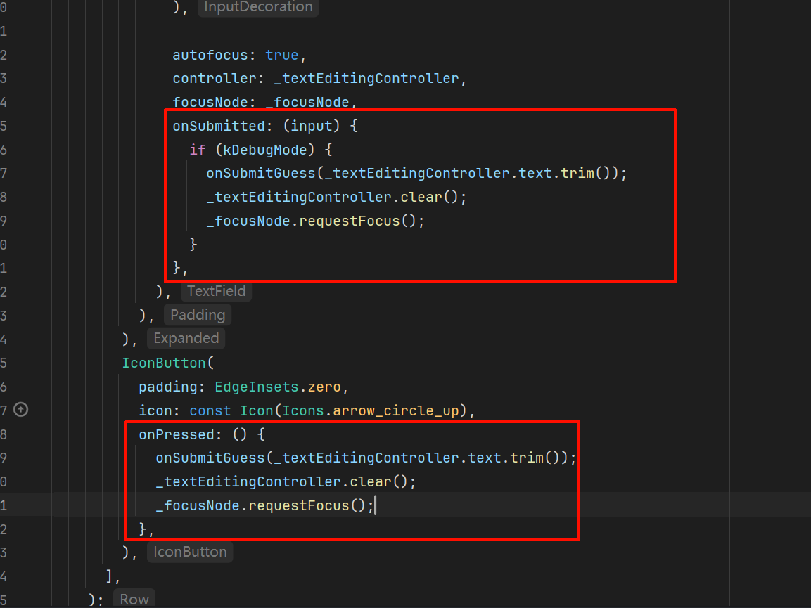
挑战
You might be thinking, "Shouldn't we abstract these methods into one function and pass it to both inputs?" You could, and as your app grows in complexity, you probably should. That said, the callbacks
IconButton.onPressedandTextField.onSubmittedhave different signatures, so it's not completely straight-forward.
你可能在想,“我们不应该将这些方法抽象成一个函数,并将其传递给两个输入吗?”你可以这样做,并且随着应用程序变得越来越复杂,你也许应该这样做。不过, IconButton.onPressed 和 TextField.onSubmitted 回调函数的签名不同,这样并不直观。
Refactor the code such that the logic inside this method isn't repeated
重构代码,使得该方法内的逻辑不重复
提取重复逻辑为一个类级别的私有方法:
class GuessInput extends StatelessWidget {
  GuessInput({super.key, required this.onSubmitGuess});

  final void Function(String) onSubmitGuess;

  final TextEditingController _textEditingController = TextEditingController();

  final FocusNode _focusNode = FocusNode();

  void _onSubmit() {
    onSubmitGuess(_textEditingController.text);
    _textEditingController.clear();
    _focusNode.requestFocus();
  }

  @override
  Widget build(BuildContext context) {
    return Row(
      children: [
        Expanded(
          child: Padding(
            padding: const EdgeInsets.all(8.0),
            child: TextField(
              maxLength: 5,
              focusNode: _focusNode,
              autofocus: true,
              decoration: const InputDecoration(
                border: OutlineInputBorder(
                  borderRadius: BorderRadius.all(Radius.circular(35)),
                ),
              ),
              controller: _textEditingController,
              onSubmitted: (value) {
                _onSubmit();
              },
            ),
          ),
        ),
        IconButton(
          padding: EdgeInsets.zero,
          icon: const Icon(Icons.arrow_circle_up),
          onPressed: _onSubmit,
        ),
      ],
    );
  }
}
做个测试 Test yourself
如何读取或清除TextField的内容
How do you programmatically read or clear the text in a TextField?
Use the TextEditingController attached to the TextField.extEditingController provides the text property to read the value and clear() method to reset it.
使用.text属性读取值、.clear()方法清空内容
如何将UI焦点移动到特定的TextField上
How do you programmatically move focus to a specific TextField?
Use a FocusNode and call `requestFocus()` on it.A FocusNode gives you control over focus, and calling
requestFocus()moves focus to its associated widget.
传递一个FocusNode对象给组件,调用FocusNode的requestFocus()方法移动焦点到与之关联的组件上
有状态的组件 Stateful widgets
引言 Introduction
So far, your app displays a grid and an input field, but the grid doesn't yet update to reflect the user's guesses. When this app is complete, each tile in the next unfilled row should update after each submitted user guess by:
- Displaying the correct letter.
- Changing color to reflect whether the letter is correct (green), is in the word but at an incorrect position (yellow), or doesn't appear in the word at all (grey).
To handle this dynamic behavior, you need to convert
GamePagefrom aStatelessWidgetto aStatefulWidget.
为什么要使用有状态组件 Why stateful widgets
When a widget's appearance or data needs to change during its lifetime, you need a
StatefulWidgetand a companionStateobject. While theStatefulWidgetitself is still immutable (its properties can't change after creation), theStateobject is long-lived, can hold mutable data, and can be rebuilt when that data changes, causing the UI to update.
当组件的外观或数据在其生命周期内需要改变时,你需要一个 StatefulWidget 和一个配套的 State 对象。虽然 StatefulWidget 本身是不可变的(创建后其属性不能改变),但 State 对象是长生命周期的,可以持有可变数据,当这些数据改变时,它可以被重建,从而更新 UI。
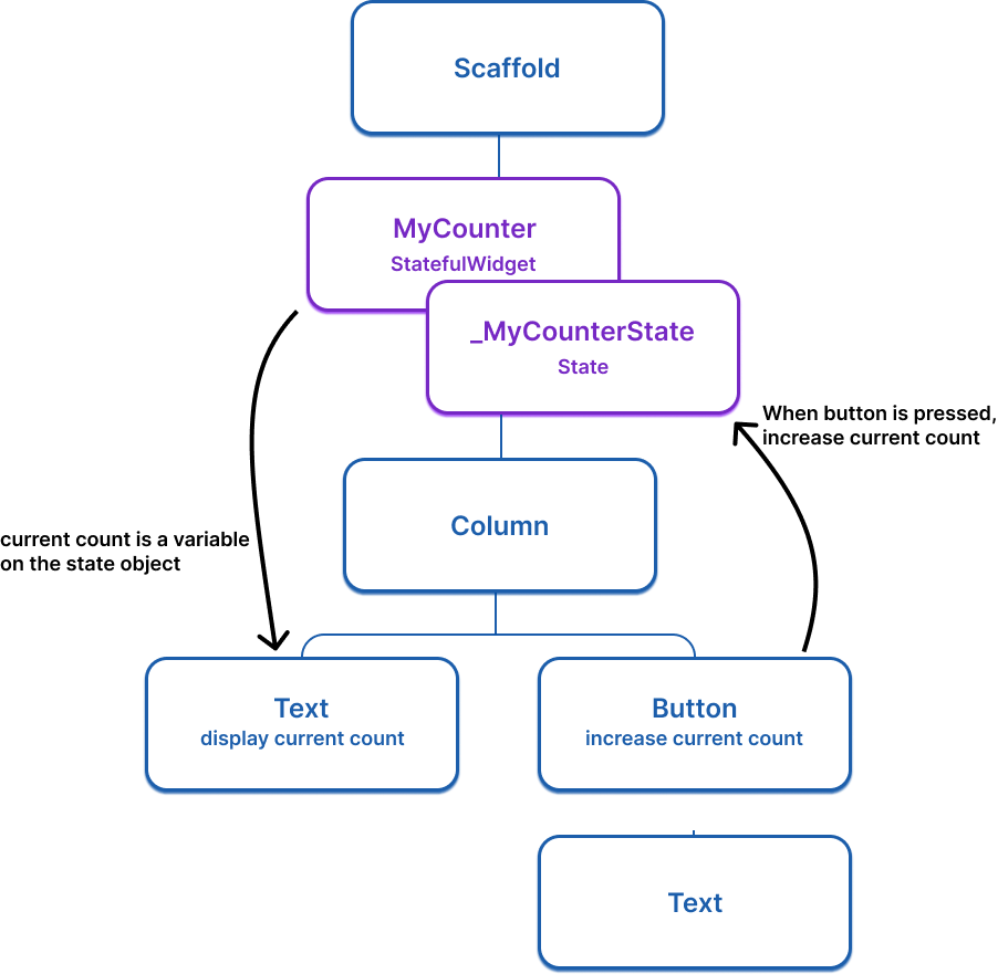
For example, the following widget tree imagines a simple app that uses a stateful widget with a counter that increases when the button is pressed.
下面的组件树构造了一个简单的应用程序,使用一个带有计数器的状态组件——按钮被按下时,计数器会递增计数
Here is the basic
StatefulWidgetstructure (doesn't do anything yet):
下面是一个最基础的StatefulWidget组件结构(现在还没有实现组件逻辑):
class ExampleWidget extends StatefulWidget {
  ExampleWidget({super.key});

  @override
  State<ExampleWidget> createState() => _ExampleWidgetState();
}

class _ExampleWidgetState extends State<ExampleWidget> {
  @override
  Widget build(BuildContext context) {
    return Container();
  }
}将GamePage更换为有状态组件 Convert GamePage to a stateful widget
To convert the
GamePage(or any other) widget from a stateless widget to a stateful widget, do the following steps:
要将 GamePage 等无状态组件转换为有状态组件,请执行以下步骤:
- Change
GamePageto extendStatefulWidgetinstead ofStatelessWidget.
将GamePage更改为扩展StatefulWidget而不再是StatelessWidget- Create a new class named
_GamePageState, that extendsState<GamePage>. This new class will hold the mutable state and thebuildmethod. Move thebuildmethod and all properties instantiated on the widget fromGamePageto the state object.
创建一个名为_GamePageState的新类,继承自State<GamePage>。这个新类将持有可变状态和build方法。将build方法以及从GamePage实例化的所有属性从 widget 移动到状态对象- Implement the
createState()method inGamePage, which returns an instance of_GamePageState
在GamePage中实现createState()方法,该方法返回一个_GamePageState的实例
提示
You don't have to manually do this work, as the Flutter plugins for VS Code and IntelliJ provide "quick assists" that can do this conversion for you.
您不必手动执行这项工作,因为 VS Code 和 IntelliJ 的 Flutter 插件提供了“快速辅助”功能,可以为您执行此转换
右键菜单 -> 显示上下文操作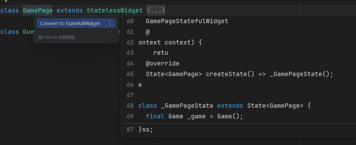
Your modified code should look like this:
修改后的代码应如下所示:
class GamePage extends StatefulWidget {
  GamePage({super.key});

  @override
  State<GamePage> createState() => _GamePageState();
}

class _GamePageState extends State<GamePage> {
  final Game _game = Game();

  @override
  Widget build(BuildContext context) {
    return Padding(
      padding: const EdgeInsets.all(8.0),
      child: Column(
        children: [
          for (var guess in _game.guesses)
            Row(
              mainAxisAlignment: MainAxisAlignment.center,
              children: [
                for (var letter in guess)
                  Padding(
                    padding: const EdgeInsets.symmetric(horizontal: 2.5, vertical: 2.5),
                    child: Tile(letter.char, letter.type),
                  )
              ],
            ),
          GuessInput(
            onSubmitGuess: (_) {
              // TODO, handle guess
              print(guess); // Temporary
            },
          ),
        ],
      ),
    );
  }
}setState更新UI Update the UI with setState
Whenever you mutate a
Stateobject, you must callsetStateto signal the framework to update the user interface and call thebuildmethod again.
每当你修改 State 对象时,你必须调用 setState 来通知框架更新用户界面并再次调用 build 方法
In this app, when a user makes a guess, the word they guessed is saved on the
Gameobject, which is a property on theGamePageclass, and therefore is state that might change and require the UI to update. When this state is mutated, the grid should be re-drawn to show the user's guess.
当用户进行猜测时,他们猜测的单词会保存在 Game 对象上,该对象是 GamePage 类的一个属性,因此它是可能发生变化并需要 UI 更新的状态。当这个状态发生变化时,网格应该重新绘制以显示用户的猜测
To implement this, update the callback function passed to
GuessInput. The function needs to callsetStateand, withinsetState, it needs to execute the logic to determine whether the users guess was correct
为了实现这一点,更新传递给 GuessInput 的回调函数。该函数需要调用 setState ,并且在 setState 内部需要执行确定用户猜测是否正确的逻辑
class GamePage extends StatefulWidget {
  GamePage({super.key});

  @override
  State<GamePage> createState() => _GamePageState();
}

class _GamePageState extends State<GamePage> {
  final Game _game = Game();

  @override
  Widget build(BuildContext context) {
    return Padding(
      padding: const EdgeInsets.all(8.0),
      child: Column(
        children: [
          for (var guess in _game.guesses)
            Row(
              mainAxisAlignment: MainAxisAlignment.center,
              children: [
                for (var letter in guess)
                  Padding(
                    padding: const EdgeInsets.symmetric(horizontal: 2.5, vertical: 2.5),
                    child: Tile(letter.char, letter.type),
                  )
              ],
            ),
          GuessInput(
           onSubmitGuess: (String guess) {
              setState(() { // NEW
                _game.guess(guess);
              });
            },
          ),
        ],
      ),
    );
  }
}
Now, when you type a legal guess into the
TextInputand submit it, the application will reflect the user's guess. If you were to call_game.guess(guess)without a callingsetState, the internal game data would change, but Flutter wouldn't know it needs to repaint the screen, and the user wouldn't see any updates.
现在,当你输入一个合法的猜测并提交到 TextInput 时,应用程序会反映用户的猜测。如果你在不调用 setState 的情况下调用 _game.guess(guess) ,内部游戏数据会发生变化,但 Flutter 不会知道它需要重新绘制屏幕,用户也不会看到任何更新
做个测试 Test yourself
什么时候该用有状态组件而不是无状态组件
When should you use a StatefulWidget instead of a StatelessWidget?
When the widget's appearance or data needs to change during its lifetime.StatefulWidget is needed when the UI must update in response to data changes over time.
忘记调用setState会发生什么
What happens if you change data in a State object without calling setState?
The data changes internally, but Flutter won't rebuild the UI to reflect the change.Without calling setState, Flutter doesn't know it needs to repaint, so the user won't see updates.
添加不明显的动画
将Container更新为AnimatedContainer Convert Container to AnimatedContainer
Currently, the
Tile.buildmethod returns aContainerto display a letter. When thehitTypechanges, like fromHitType.nonetoHitType.hit, the background color of the tile changes instantly. For example, from white to green in the case ofHitType.nonetoHitType.hit.
目前, Tile.build 方法返回一个 Container 来显示一个字母。当 hitType 变化时,例如从 HitType.none 变为 HitType.hit ,瓦片的背景颜色会立即改变。例如,在 HitType.none 到 HitType.hit 的情况下,从白色变为绿色
For reference, here's the current implementation of the
Tilewidget:
作为参考,以下是 Tile 组件的当前实现:
class Tile extends StatelessWidget {
  const Tile(this.letter, this.hitType, {super.key});

  final String letter;
  final HitType hitType;

  @override
  Widget build(BuildContext context) {
    return Container(
      height: 60,
      width: 60,
      decoration: BoxDecoration(
        border: Border.all(color: Colors.grey.shade300),
        color: switch (type) {
          HitType.hit => Colors.green,
          HitType.partial => Colors.yellow,
          HitType.miss => Colors.grey,
          _ => Colors.white,
        },
      ),
      child: Center(
        child: Text(
          letter.toUpperCase(),
          style: Theme.of(context).textTheme.titleLarge,
        ),
      ),
    );
  }
}
To make the color change animate smoothly, replace the
Containerwidget with anAnimatedContainer.
要使颜色平滑变化,请将 Container 组件替换为 AnimatedContainer
An
AnimatedContaineris like aContainer, but it automatically animates changes to its properties over a specifiedduration. When properties such ascolor,height,width,decoration, oralignmentchange,AnimatedContainerinterpolates between the old and new values, creating a smooth transition
AnimatedContainer 类似于 Container ,但它会自动在指定的 duration 内对其属性添加变化动画。当 color 、 height 、 width 、 decoration 或 alignment 等属性发生变化时, AnimatedContainer 会在旧值和新值之间进行插值,从而创建平滑的过渡效果
Modify your
Tilewidget as follows:
请按如下方式修改您的 Tile 组件:
class Tile extends StatelessWidget {
  const Tile(this.letter, this.hitType, {super.key});

  final String letter;
  final HitType hitType;

  @override
  Widget build(BuildContext context) {
    return AnimatedContainer(
      duration: Duration(milliseconds: 500),
      height: 60,
      width: 60,
      decoration: BoxDecoration(
        border: Border.all(color: Colors.grey.shade300),
        color: switch (hitType) {
          HitType.hit => Colors.green,
          HitType.partial => Colors.yellow,
          HitType.miss => Colors.grey,
          _ => Colors.white,
        },
      ),
      child: Center(
        child: Text(
          letter.toUpperCase(),
          style: Theme.of(context).textTheme.titleLarge,
        ),
      ),
    );
  }
}
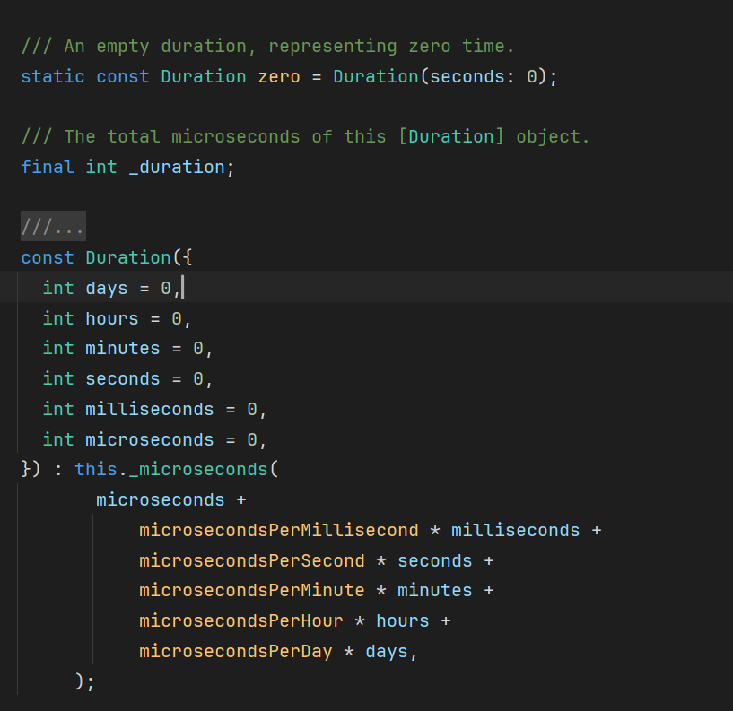
durationis a required property that specifies how long the animation should take. In this example, passingDuration(milliseconds: 500)means the color transition will take half a second. You can also specify seconds, minutes, and many other units of time.
duration 是一个必需的属性,用于指定动画的持续时间。在这个例子中,传入 Duration(milliseconds: 500) 表示颜色过渡将花费半秒。你也可以指定秒、分钟和其他许多时间单位
注
Now, when the
hitTypechanges and theTilewidget rebuilds (becausesetStatewas called inGamePage), the color of the tile smoothly animates from its old color to the new one over the specified duration.
现在,当 hitType 发生变化并且 Tile 组件重建(因为 setState 在 GamePage 中被调用),瓦片的颜色会在指定的持续时间内平滑地从旧颜色过渡到新颜色
调整动画曲线 Adjust the animation curve
To add a bit of customization to an implicit animation, you can pass it a different
Curve. Different curves change the speed of the animation at different points throughout the animation.
要为隐式动画添加一些自定义,你可以传递给它不同的 Curve 。不同的曲线会改变动画在整个动画过程中的不同点的速度
For example, the default curve for Flutter animations is
Curves.linear. This gif shows how the animation curve behaves:
例如,Flutter 动画的默认曲线是 Curves.linear 。这个 Gif 展示了动画曲线的行为方式:
原本的GIF
注
本博客对GIF内容支持有限
Compare that to
Curve.bounceIn, another common curve:
与 Curve.bounceIn 进行比较,这是另一个常见的曲线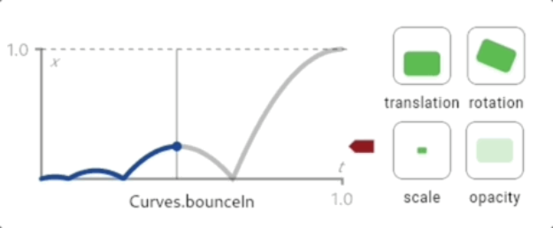
To change the
Curveof this animation, update the code to the following:
要更改此动画的 Curve ,请将代码更新为以下内容:
class Tile extends StatelessWidget {
  const Tile(this.letter, this.hitType, {super.key});

  final String letter;
  final HitType hitType;

  @override
  Widget build(BuildContext context) {
    return AnimatedContainer(
      duration: Duration(milliseconds: 500),
      curve: Curves.bounceIn, // NEW
      height: 60,
      width: 60,
      decoration: BoxDecoration(
        border: Border.all(color: Colors.grey.shade300),
        color: switch (hitType) {
          HitType.hit => Colors.green,
          HitType.partial => Colors.yellow,
          HitType.miss => Colors.grey,
          _ => Colors.white,
        },
      ),
      child: Center(
        child: Text(
          letter.toUpperCase(),
          style: Theme.of(context).textTheme.titleLarge,
        ),
      ),
    );
  }
}
There are many different curves provided by the Flutter SDK, so feel free to try them out by passing different types to the
curveparameter.
Flutter SDK 提供了许多不同的曲线,因此可以尝试通过向 curve 参数传递不同类型来使用它们
Implicit animations like
AnimatedContainerare powerful because you just tell the widget what the new state should be, and it handles the "how" of the animation.
隐式动画如 AnimatedContainer 非常强大,因为你只需要告诉小部件新的状态,它就会处理动画的“如何”部分
For complex, custom animations, you can write your own animated widgets. If you're curious, try it out in the animations tutorial.
对于复杂的自定义动画,你可以编写自己的动画小部件。如果你感兴趣,可以在动画教程中尝试一下
花絮
教程走完了才发现自己一次都没有玩过这个程序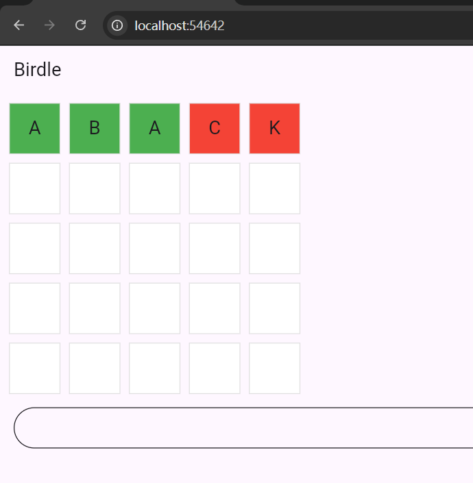
不是连字成词,而是盲猜字母