从零开始的Fyne(二):组件与容器
探索Fyne
Canvas与CanvasObject
In Fyne, a
Canvasis the area within which an application is drawn. Each window has a canvas, which you can access withWindow.Canvas(), but usually, you will find functions onWindowthat avoid directly accessing the canvas.
在Fyne中,Canvas就是一块用来绘制APP的区域。每个窗口都会有一个canvas,可以用Window.Canvas()访问,但一般来说,你应该调用Window的方法,而不是直接操作Canvas
Everything that can be drawn in Fyne is a type of
CanvasObject. The example here opens a new window and then shows different types of primitive graphical elements by setting the content of the window canvas. There are many ways that each type of object can be customised, as shown with the text and circle examples.
CanvasObject就是Fyne中用来绘制一切的实例。下面的例子演示了如何打开一个新窗口并通过设置Window canvas来显示两个不同形状的元素。我们可以自定义很多组件/CanvasObject,下面所演示的是文本组件和圆圈组件
As well as changing the content shown using
Canvas.SetContent(), it is possible to change the properties of existing canvas objects. For example, you can change theFillColorof a rectangle and then callrect.Refresh()to update its appearance. When performing such updates from a goroutine, you should use thefyne.Dofunction to queue the updates safely on the main goroutine, ensuring thread safety as required since Fyne v2.6.0.
我们可以使用Canvas.SetContent()修改显示出来的组件内容,也可以直接修改已存在的canvas对象的属性。比如我们可以直接修改矩形元素的FillColor属性,然后调用rect.Refresh()更新它的外观。如果是在协程里执行这种更新,你应该使用fyne.Do函数,将更新事件放入队列中,并确保你的fyne版本高于2.6.0,因为fyne 2.6.0之后更新了其协程机制,带来了更好的线程安全
package main

import (
    "image/color"
    "log"    "time"
    "fyne.io/fyne/v2"    "fyne.io/fyne/v2/app"    "fyne.io/fyne/v2/canvas")

func main() {
    // _ = os.Setenv("FYNE_THEME", "light")

    myApp := app.New()
    myWindow := myApp.NewWindow("Canvas")
    myCanvas := myWindow.Canvas()

    blue := color.NRGBA{R: 0, G: 0, B: 255, A: 255}
    rect := canvas.NewRectangle(blue)
    myCanvas.SetContent(rect)

    go func() {
       time.Sleep(time.Second)
       green := color.NRGBA{R: 0, G: 255, B: 0, A: 255}
       fyne.Do(func() {
          rect.FillColor = green
          rect.Refresh()
       })
    }()

    myWindow.Resize(fyne.NewSize(300, 300))
    myWindow.Show()
    myApp.Run()

    log.Printf("程序退出")
}
我们还可以以同样方式绘制很多不同的元素,比如画个圆和一个文本:
func setContentToText(c fyne.Canvas) {
    green := color.NRGBA{R: 0, G: 255, B: 0, A: 255}
    text := canvas.NewText("Hello World", green)
    text.TextStyle.Bold = true
    c.SetContent(text)
}
func setContentToCircle(c fyne.Canvas) {
    red := color.NRGBA{R: 255, G: 0, B: 0, A: 255}
    circle := canvas.NewCircle(color.White)
    circle.StrokeWidth = 4
    circle.StrokeColor = red
    c.SetContent(circle)
}
Widget 工具组件
A
fyne.Widgetis a special type of canvas object that has interactive elements associated with it. In widgets, the logic is separate from the way that it looks (also called theWidgetRenderer).
fyne.Widget是一种特殊的Canvas对象,拥有可交互元素。wigets的渲染(WidgetRender)和事件逻辑是分离的
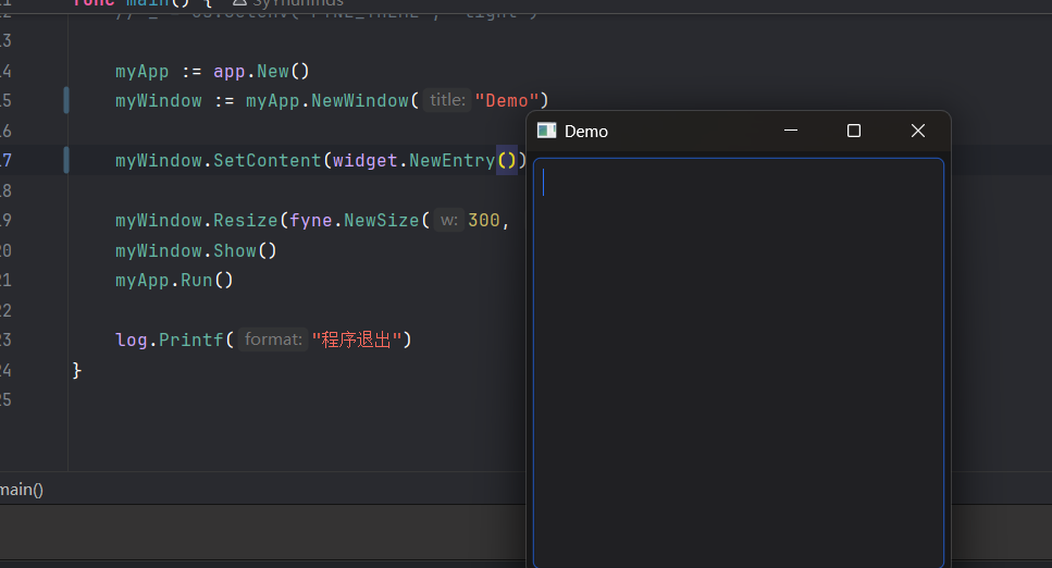
Widgets are also types of
CanvasObject, so we can set the content of our window to a single widget. See how we create a newwidget.Entryand set it as the content of the window in this example.
Widgets也是一种CanvasObject,所以我们可以把窗口内容设置成单独一个Widget。下面的例子演示了如何创建一个新的文本输入框Widget.Entry并将其设为窗口的内容:
package main

import (
    "log"

    "fyne.io/fyne/v2"    "fyne.io/fyne/v2/app"    "fyne.io/fyne/v2/widget")

func main() {
    // _ = os.Setenv("FYNE_THEME", "light")

    myApp := app.New()
    myWindow := myApp.NewWindow("Demo")

    myWindow.SetContent(widget.NewEntry())

    myWindow.Resize(fyne.NewSize(300, 300))
    myWindow.Show()
    myApp.Run()

    log.Printf("程序退出")
}
容器与布局
In the previous example we saw how to set a
CanvasObjectto the content of aCanvas, but it is not very useful to only show one visual element. To show more than one item we use theContainertype.
在前面的例子中我们了解到了如何将一个CanvasObject设置为画布区域Canvas的内容,但仅仅只显示一个可见元素是不够的。为了渲染更多元素,我们需要使用Container/容器 类型
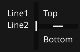
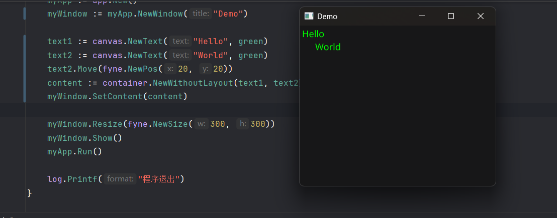
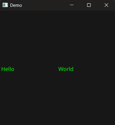
As the
fyne.Containeralso is afyne.CanvasObject, we can set it to be the content of afyne.Canvas. In this example we create 3 text objects and then place them in a container using thecontainer.NewWithoutLayout()function. As there is no layout set we can move the elements around like you see withtext2.Move().
鉴于fyne.Container也是一种画布对象,我们可以将其设置为fyne.Canvas的内容。在下面的例子中我们将创建三个文本对象,将其放置在由container.NewWithoutLayout创建的容器中。由于使用了无布局的容器,我们要使用text.Move()方法手动把组件移开:
package main

import (
    "image/color"
    "log"
    "fyne.io/fyne/v2"    "fyne.io/fyne/v2/app"    "fyne.io/fyne/v2/canvas"    "fyne.io/fyne/v2/container")

var green = color.NRGBA{G: 0xff, A: 0xff}
var blue = color.NRGBA{B: 0xff, A: 0xff}
var red = color.NRGBA{R: 0xff, A: 0xff}

func main() {
    // _ = os.Setenv("FYNE_THEME", "light")

    myApp := app.New()
    myWindow := myApp.NewWindow("Demo")

    text1 := canvas.NewText("Hello", green)
    text2 := canvas.NewText("World", green)
    text2.Move(fyne.NewPos(20, 20))
    content := container.NewWithoutLayout(text1, text2)
    myWindow.SetContent(content)

    myWindow.Resize(fyne.NewSize(300, 300))
    myWindow.Show()
    myApp.Run()

    log.Printf("程序退出")
}
A
fyne.Layoutimplements a method for organising items within a container. By uncommenting thecontainer.New()line in this example you alter the container to use a grid layout with 2 columns. Run this code and try resizing the window to see how the layout automatically configures the contents of the window. Notice also that the manual position oftext2is ignored by the layout code.
fyne.Layout实现了在容器内组织元素的方法。(原本的代码里)通过取消container.New()注释,你将获得一个使用两列的网格布局。注意对text2的手动布局设置现在会被布局代码忽略
package main

import (
    "image/color"
    "log"
    "fyne.io/fyne/v2"    "fyne.io/fyne/v2/app"    "fyne.io/fyne/v2/canvas"    "fyne.io/fyne/v2/container"    "fyne.io/fyne/v2/layout")

var green = color.NRGBA{G: 0xff, A: 0xff}
var blue = color.NRGBA{B: 0xff, A: 0xff}
var red = color.NRGBA{R: 0xff, A: 0xff}

func main() {
    // _ = os.Setenv("FYNE_THEME", "light")

    myApp := app.New()
    myWindow := myApp.NewWindow("Demo")

    text1 := canvas.NewText("Hello", green)
    text2 := canvas.NewText("World", green)
    text2.Move(fyne.NewPos(20, 20))
    // content := container.NewWithoutLayout(text1, text2)
    content := container.New(layout.NewGridLayout(2), text1, text2)
    myWindow.SetContent(content)

    myWindow.Resize(fyne.NewSize(300, 300))
    myWindow.Show()
    myApp.Run()

    log.Printf("程序退出")

}
To see more you can check out the
Layout list.
交互式组件(Widget)
标准组件(由widget包提供)
折叠列表/手风琴样式/Accordion
Accordion displays a list of AccordionItems. Each item is represented by a button that reveals a detailed view when tapped.
type AccordionItem struct {
Title string
Detail fyne.CanvasObject
Open bool
}
func NewAccordionItem(title string, detail fyne.CanvasObject) *AccordionItem
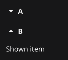
func NewAccordion(items ...*AccordionItem) *Accordionfunc setContentToFruitAccordion(w fyne.Window, app fyne.App) {
fruits := map[string]string{
"A": "Apple",
"B": "Banana",
"C": "Cherry",
}
fruitAccordionItems := make([]*widget.AccordionItem, len(fruits))
idx := 0
for k, v := range fruits {
fruitAccordionItems[idx] = widget.NewAccordionItem(k, widget.NewLabel(v))
idx++
}
fruitAccordion := widget.NewAccordion(fruitAccordionItems...)
w.SetContent(container.NewVBox(
fruitAccordion,
layout.NewSpacer(),
widget.NewButton("退出", func() {
app.Quit()
}),
))
}动点/Activity
Display an animated activity indicator.

type Activity struct {
    BaseWidget
    started bool
}
func setContentToActivity(win fyne.Window, app fyne.App) {
activity := widget.NewActivity()
quitButton := widget.NewButton("退出", func() {
app.Quit()
})
win.SetContent(container.NewVBox(activity, quitButton))
go func() {
ticker := time.NewTicker(time.Second)
defer ticker.Stop()
for {
select {
case <-ticker.C:
activity.Start()
time.Sleep(200 * time.Millisecond)
activity.Stop()
}
}
}()
}
你能看出来它在动吗?
按钮/Button
Button widget has a text label and icon, both are optional.

type Button struct {
    DisableableWidget
    Text             string
    Icon             fyne.Resource
    Importance       Importance
    Alignment        ButtonAlign
    IconPlacement    ButtonIconPlacement
    OnTapped         func() `json:"-"`
    hovered, focused bool
    tapAnim          *fyne.Animation
卡片/Card
Card widget groups elements with a header and subheader, all are optional.
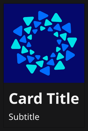
type Card struct {
BaseWidget
Title, Subtitle string
Image *canvas.Image
Content fyne.CanvasObject
}
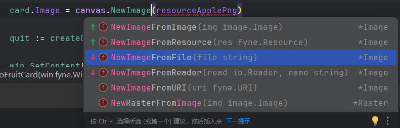
func NewCard(title string, subtitle string, content fyne.CanvasObject) *Cardfunc setContentToFruitCard(win fyne.Window, app fyne.App) {
const fileApplePng = "./assets/apple.png"
card := widget.NewCard("Apple", "A red fruit",
nil, // *fyne.Object
)
card.Image = canvas.NewImageFromFile(fileApplePng)
quit := createQuitButton(app)
win.SetContent(container.NewVBox(card, quit))
}
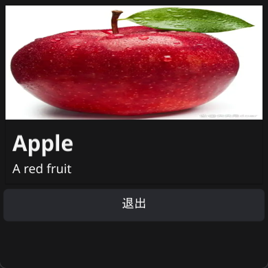
宽体苹果
单选框/Check
描述
Check widget has a text label and a checked (or unchecked) icon.

源码
type Check struct {
    DisableableWidget
    Text      string
    Checked   bool
    Partial   bool
    OnChanged func(bool) `json:"-"`
    focused   bool
    hovered   bool
    binder    basicBinder
    minSize   fyne.Size
}

func NewCheck(label string, changed func(bool)) *Check
func NewCheckWithData(label string, data binding.Bool) *Check
代码示例
func setContentToCheck(win fyne.Window, app fyne.App) {
    label := widget.NewLabel("Hello World")
    check := widget.NewCheck("点击显示问候语", func(b bool) {
       label.Hidden = !b
    })
    quit := createQuitButton(app)

    win.SetContent(container.NewVBox(
       check,
       label,
       quit,
    ))

}
演示
文本输入框/Entry
描述
Entry widget allows simple text to be input when focused.
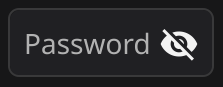
PasswordEntry widget hides text input and adds a button to display the text.


源码
仙之人兮列如麻
type Entry struct {
DisableableWidget
shortcut fyne.ShortcutHandler
Text string
TextStyle fyne.TextStyle
PlaceHolder string
OnChanged func(string) `json:"-"`
OnSubmitted func(string) `json:"-"`
Password bool
MultiLine bool
Wrapping fyne.TextWrap
Scroll fyne.ScrollDirection
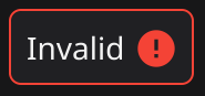
Validator fyne.StringValidator `json:"-"` // 注意这个, 这个是func(string) error函数的类型别称
validationStatus *validationStatus
onValidationChanged func(error)
validationError error
AlwaysShowValidationError bool
CursorRow, CursorColumn int
OnCursorChanged func() `json:"-"`
Icon fyne.Resource `json:"-"`
cursorAnim *entryCursorAnimation
dirty bool
focused bool
text RichText
placeholder RichText
content *entryContent
scroll *widget.Scroll
onFocusChanged func(bool)
selectKeyDown bool
sel *selectable
popUp *PopUpMenu
ActionItem fyne.CanvasObject `json:"-"`
binder basicBinder
conversionError error
minCache fyne.Size
multiLineRows int
undoStack entryUndoStack
}// NewEntry creates a new single line entry widget.
func NewEntry() *Entry
// NewEntryWithData returns an Entry widget connected to the specified data source.//
// Since: 2.0
func NewEntryWithData(data binding.String)
// NewMultiLineEntry creates a new entry that allows multiple lines
func NewMultiLineEntry()
// NewPasswordEntry creates a new entry password widget
func NewPasswordEntry()代码示例
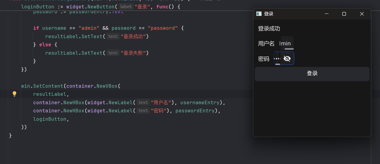
func setContentToLoginEntry(win fyne.Window, app fyne.App) {
    // 登录表单
    win.SetTitle("登录")
    resultLabel := widget.NewLabel("")

    usernameEntry := widget.NewEntry()
    usernameEntry.SetPlaceHolder("请输入用户名")
    usernameEntry.Resize(fyne.NewSize(200, 30))

    passwordEntry := widget.NewPasswordEntry()
    passwordEntry.SetPlaceHolder("请输入密码")
    passwordEntry.Resize(fyne.NewSize(200, 30)) // 这是没用的, 因为后面用了容器布局 // 有需要的话请出门右转widgetForm

    loginButton := widget.NewButton("登录", func() {
       username := usernameEntry.Text
       password := passwordEntry.Text

       if username == "admin" && password == "password" {
          resultLabel.SetText("登录成功")
       } else {
          resultLabel.SetText("登录失败")
       }
    })

    win.SetContent(container.NewVBox(
       resultLabel,
       container.NewHBox(widget.NewLabel("用户名"), usernameEntry),
       container.NewHBox(widget.NewLabel("密码"), passwordEntry),
       loginButton,
    ))
}
演示
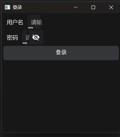
BYD气笑了 这么短一截输入框
文件样式图标/FileIcon
描述
FileIcon provides helpful standard icons for various types of file. It displays the type of file as an indicator icon and shows the extension of the file type.

源码
type FileIcon struct {
    BaseWidget
    Selected  bool
    URI       fyne.URI
    resource  fyne.Resource
    extension string
}

// NewFileIcon takes a filepath and creates an icon with an overlaid label using the detected mimetype and extension
//
// Since: 1.4
func NewFileIcon(uri fyne.URI) *FileIconfyne.URL:
// URI represents the identifier of a resource on a target system. This// resource may be a file or another data source such as an app or file sharing
// system. The URI represents an absolute location of a resource, it is up to any// parse or constructor implementations to ensure that relative resources are made absolute.
//
// In general, it is expected that URI implementations follow IETF RFC3986.// Implementations are highly recommended to utilize [net/url] to implement URI
// parsing methods, especially [net/url/url.Scheme], [net/url/url.Authority],
// [net/url/url.Path], [net/url/url.Query], and [net/url/url.Fragment].
type URI interface {
fmt.Stringer
// Extension should return the file extension of the resource // (including the dot) referenced by the URI. For example, the
// Extension() of 'file://foo/bar.baz' is '.baz'. May return an
// empty string if the referenced resource has none.
Extension() string
// Name should return the base name of the item referenced by the URI.
// For example, the name of 'file://foo/bar.baz' is 'bar.baz'.
Name() string
// MimeType should return the content type of the resource referenced // by the URI. The returned string should be in the format described
// by Section 5 of RFC2045 ("Content-Type Header Field").
MimeType() string
// Scheme should return the URI scheme of the URI as defined by IETF // RFC3986. For example, the Scheme() of 'file://foo/bar.baz` is
// 'file'. // // Scheme should always return the scheme in all lower-case characters.
Scheme() string
// Authority should return the URI authority, as defined by IETF // RFC3986. // // NOTE: the RFC3986 can be obtained by combining the [net/url.URL.User]
// and [net/url.URL.Host]. Consult IETF RFC3986, section
// 3.2, pp. 17. // // Since: 2.0
Authority() string
// Path should return the URI path, as defined by IETF RFC3986. // // Since: 2.0
Path() string
// Query should return the URI query, as defined by IETF RFC3986. // // Since: 2.0
Query() string
// Fragment should return the URI fragment, as defined by IETF // RFC3986. // // Since: 2.0
Fragment() string
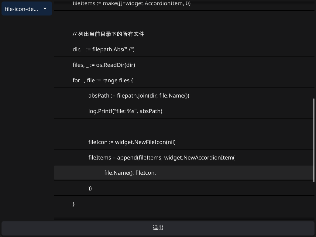
}func setContentToFileIcon(win fyne.Window, app fyne.App) {
fileIcons := widget.NewFileIcon(nil)
quit := createQuitButton(app)
fileItems := make([]*widget.AccordionItem, 0)
// 列出当前目录下的所有文件
dir, _ := filepath.Abs("./")
files, _ := os.ReadDir(dir)
for _, file := range files {
absPath := filepath.Join(dir, file.Name())
log.Printf("file: %s", absPath)
fileIcon := widget.NewFileIcon(nil) // 谢邀, 改不动里面的URL值
fileItems = append(fileItems, widget.NewAccordionItem(
file.Name(), fileIcon,
))
}
win.SetContent(container.NewVBox(
fileIcons,
quit,
))
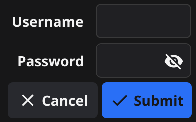
}表单/Form
描述
Form widget is two column grid where each row has a label and a widget (usually an input). The last row of the grid will contain the appropriate form control buttons if any should be shown.
源码
type Form struct {
    BaseWidget
    Items               []*FormItem
    OnSubmit            func() `json:"-"`
    OnCancel            func() `json:"-"`
    SubmitText          string
    CancelText          string
    Orientation         Orientation
    itemGrid            *fyne.Container
    buttonBox           *fyne.Container
    cancelButton        *Button
    submitButton        *Button
    disabled            bool
    onValidationChanged func(error)
    validationError     error
}

// NewForm creates a new form widget with the specified rows of form items// and (if any of them should be shown) a form controls row at the bottom
func NewForm(items ...*FormItem) *Form {
    form := &Form{Items: items}
    form.ExtendBaseWidget(form)

    return form
}
代码示例
// 和Entry的示例差不多,只是改了布局

win.SetContent(container.NewVBox(
    resultLabel,
    widget.NewForm(
       &widget.FormItem{
          Text:   "用户名",
          Widget: usernameEntry,
       },
       &widget.FormItem{
          Text:   "密码",
          Widget: passwordEntry,
       },
    ),
    loginButton,
))
演示
现在就好多了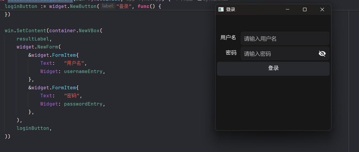
超链接/Hyperlink
描述
Hyperlink widget is a text component with appropriate padding and layout. When clicked, the URL opens in your default web browser.

源码
// url.URL
type URL struct {
    Scheme      string
    Opaque      string
    User        *Userinfo
    Host        string
    Path        string
    RawPath     string
    OmitHost    bool
    ForceQuery  bool
    RawQuery    string
    Fragment    string
    RawFragment string
}

type Hyperlink struct {
    BaseWidget
    Text             string
    URL              *url.URL
    Alignment        fyne.TextAlign
    Wrapping         fyne.TextWrap
    TextStyle        fyne.TextStyle
    Truncation       fyne.TextTruncation
    SizeName         fyne.ThemeSizeName
    OnTapped         func() `json:"-"`
    textSize         fyne.Size
    focused, hovered bool
    provider         RichText
}

// NewHyperlink creates a new hyperlink widget with the set text content
func NewHyperlink(text string, url *url.URL) *Hyperlink
// NewHyperlinkWithStyle creates a new hyperlink widget with the set text content
func NewHyperlinkWithStyle(text string, url *url.URL, alignment fyne.TextAlign, style fyne.TextStyle) *Hyperlin
代码示例
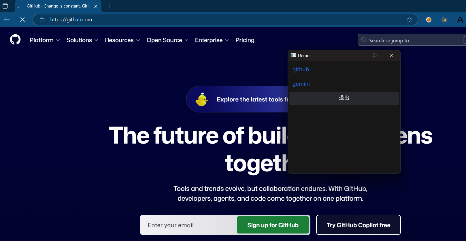
func setContentToHyperlink(win fyne.Window, app fyne.App) {
    link1 := widget.NewHyperlink("github", &url.URL{
       Scheme: "https",
       Host:   "github.com",
       Path:   "/",
    })
    link2 := widget.NewHyperlink("gemini", &url.URL{
       Scheme: "https",
       Host:   "gemini.google.com",
       Path:   "/",
    })
    quit := createQuitButton(app)

    win.SetContent(container.NewVBox(
       link1,
       link2,
       quit,
    ))
}
演示
Icon/图标
描述
Icon widget is a basic image component that loads its resource to match the theme.

标签/Label
描述
Label widget is a label component with appropriate padding and layout.

进度条/Progress Bar
描述
ProgressBar widget creates a horizontal panel that indicates progress.
ProgressBarInfinite widget creates a horizontal panel that indicates waiting indefinitely An infinite progress bar loops 0% -> 100% repeatedly until Stop() is called.


源码
type ProgressBar struct {
    BaseWidget
    Min, Max, Value float64
    TextFormatter   func() string `json:"-"`
    binder          basicBinder
}

// NewProgressBar creates a new progress bar widget.// The default Min is 0 and Max is 1, Values set should be between those numbers.
// The display will convert this to a percentage.
func NewProgressBar() *ProgressBar
// NewProgressBarWithData returns a progress bar connected with the specified data source.//
// Since: 2.0
func NewProgressBarWithData(data binding.Float) *ProgressBar

type ProgressBarInfinite struct {
    BaseWidget
    running bool
}
// NewProgressBarInfinite creates a new progress bar widget that loops indefinitely from 0% -> 100%// SetValue() is not defined for infinite progress bar
// To stop the looping progress and set the progress bar to 100%, call ProgressBarInfinite.Stop()
func NewProgressBarInfinite() *ProgressBarInfinite {
    bar := &ProgressBarInfinite{}
    bar.ExtendBaseWidget(bar)
    return bar
}
代码示例
func setContentToProgressBar(win fyne.Window, app fyne.App) {
    normalBar := widget.NewProgressBar()
    normalBar.Min = 0
    normalBar.Value = 0
    normalBar.Max = 100

    go func() {
       // 更新常规进度条
       for normalBar.Value <= normalBar.Max {
          fyne.Do(func() {
             normalBar.SetValue(normalBar.Value + 10)
             normalBar.Refresh() // 需要显式刷新组件的状态
          })
          time.Sleep(time.Millisecond * 500)
       }
    }()

    infiniteBar := widget.NewProgressBarInfinite()
    checkBarRunning := widget.NewCheck("点击切换循环进度条的动画状态", func(b bool) {
       if b {
          infiniteBar.Start()
       } else {
          infiniteBar.Stop()
       }
    })

    quit := createQuitButton(app)

    win.SetContent(container.NewVBox(
       // 使用Grid/网格布局可以让组件自动适应容器空间
       container.NewGridWithColumns(2, widget.NewLabel("常规进度条"), normalBar),
       container.NewGridWithColumns(2, widget.NewLabel("循环进度条"), infiniteBar, checkBarRunning),
       quit,
    ))
}
演示
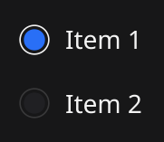
多选框/RadioGroup
描述
RadioGroup widget has a list of text labels and radio check icons next to each.
源码
type RadioGroup struct {
    DisableableWidget
    Horizontal bool
    Required   bool
    OnChanged  func(string) `json:"-"`
    Options    []string
    Selected   string
    _selIdx    int
}

// NewRadioGroup creates a new radio group widget with the set options and change handler//
// Since: 1.4
func NewRadioGroup(options []string, changed func(string)) *RadioGroup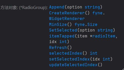
代码示例
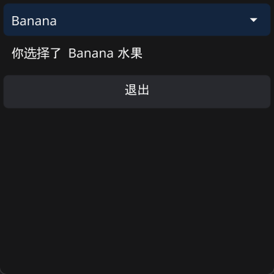
func setContentToRadioGroupDemo(win fyne.Window, app fyne.App) {
    fruits := []string{"Apple", "Banana", "Cherry"}
    chosenLabel := widget.NewLabel("你选择了 ? ")

    radio := widget.NewRadioGroup(fruits, func(option string) {
       chosenLabel.SetText(fmt.Sprintf("你选择了 %s 水果", option))
    })

    quit := createQuitButton(app)

    win.SetContent(container.NewGridWithRows(3,
       chosenLabel,
       radio,
       quit,
    ))
}
演示
富文本/RichText
描述
RichText widget is a text component that shows various styles and embedded objects. It supports markdown parsing to construct the widget with ease.
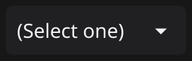
下拉列表/Select
描述
Select widget has a list of options, with the current one shown, and triggers an event function when clicked.
源码
// Select widget has a list of options, with the current one shown, and triggers an event func when clickedtype Select struct {
    DisableableWidget

    // Alignment sets the text alignment of the select and its list of options.    //    // Since: 2.1    Alignment   fyne.TextAlign
    Selected    string
    Options     []string
    PlaceHolder string
    OnChanged   func(string) `json:"-"`

    binder basicBinder

    focused bool
    hovered bool
    popUp   *PopUpMenu
    tapAnim *fyne.Animation
}

// NewSelect creates a new select widget with the set list of options and changes handler
func NewSelect(options []string, changed func(string)) *Select
// NewSelectWithData returns a new select widget connected to the specified data source.//
// Since: 2.6
func NewSelectWithData(options []string, data binding.String) *Select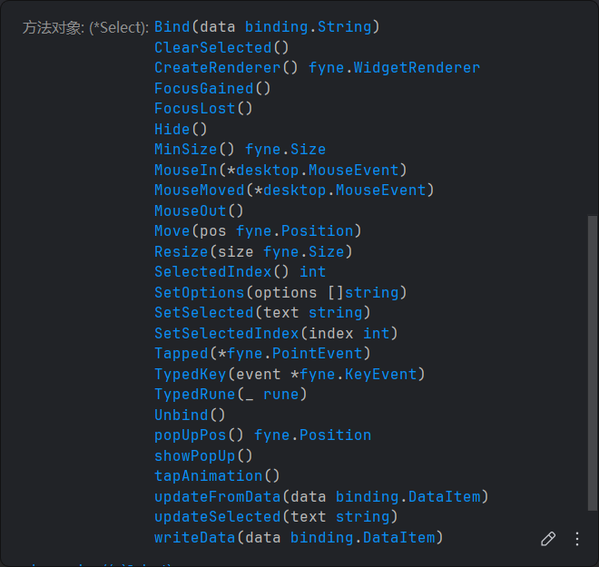
代码示例
func setContentToSelect(win fyne.Window, app fyne.App) {
    fruits := []string{"Apple", "Banana", "Cherry"}
    chosenLabel := widget.NewLabel("你选择了 ? 水果")

    selectOptions := widget.NewSelect(fruits, func(s string) {
       chosenLabel.SetText(fmt.Sprintf("你选择了 %s 水果", s))
    })
    selectOptions.SetSelected("Apple") // 默认选中Apple

    quit := createQuitButton(app)

    win.SetContent(container.NewVBox(
       selectOptions,
       chosenLabel,
       quit,
    ))
}
演示
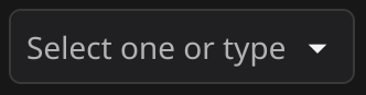
可增加内容的下拉列表/SelectEntry
描述
Select entry widget adds an editable component to the select widget. Users can select an option or enter their own value.
源码
// SelectEntry is an input field which supports selecting from a fixed set of options.
type SelectEntry struct {
    Entry  // SelectEntry是Entry的子类
    dropDown *fyne.Menu
    popUp    *PopUpMenu
    options  []string
}

// NewSelectEntry creates a SelectEntry.
func NewSelectEntry(options []string) *SelectEntry
代码示例
因为SelectEntry是套了Entry壳的下拉列表(没有回调函数),所以要用Entry的API来手动实现回调函数(不大推荐这么做)
func setContentToSelectEntry(win fyne.Window, app fyne.App) {
    fruits := []string{"Apple", "Banana", "Cherry"}
    chosenLabel := widget.NewLabel("你选择了 ? 水果")
    waringLabel := widget.NewLabel("")

    selectOptions := widget.NewSelectEntry(fruits)
    submitNewOption := widget.NewButton("提交", func() {
       defer func() {
          selectOptions.SetText("") // 清空输入内容
       }()

       newText := selectOptions.Text
       for _, fruit := range fruits {
          if fruit == newText {
             waringLabel.SetText("请勿重复添加")
             waringLabel.Refresh()
             return
          }
       }

       fruits = append(fruits, newText)
       selectOptions.SetOptions(fruits) // 更新选项
    })
    confirmOption := widget.NewButton("确认", func() {
       defer func() {
          selectOptions.SetText("") // 清空输入内容
       }()

       chosenLabel.SetText(fmt.Sprintf("你选择了 %s 水果", selectOptions.Text))
       chosenLabel.Refresh()
    })
    selectOptions.Validator = func(s string) error {
       if s == "" {
          waringLabel.SetText("请输入内容")
          waringLabel.Refresh()
          return errors.New("请输入内容")
       }
       return nil
    }

    quit := createQuitButton(app)

    win.SetContent(container.NewVBox(
       chosenLabel,
       container.NewGridWithColumns(3, selectOptions, submitNewOption, confirmOption),
       layout.NewSpacer(),
       waringLabel,
       quit,
    ))
}
演示
分隔符/分隔线/Separator
描述
Separator widget shows a dividing line between other elements.

代码示例
win.SetContent(container.NewVBox(
    chosenLabel,
    container.NewGridWithColumns(3, selectOptions, submitNewOption, confirmOption),
    &widget.Separator{}, // 这么用
    waringLabel,
    quit,
))
滑条/Slider
描述
Slider if a widget that can slide between two fixed values.

源码
// Slider is a widget that can slide between two fixed values.type Slider struct {
    BaseWidget

    Value float64
    Min   float64
    Max   float64
    Step  float64

    Orientation Orientation
    OnChanged   func(float64) `json:"-"`

    // Since: 2.4
    OnChangeEnded func(float64) `json:"-"`

    binder        basicBinder  // 这个组件也是响应式的
    hovered       bool
    focused       bool
    disabled      bool // don't use DisableableWidget so we can put Since comments on funcs
    pendingChange bool // true if value changed since last OnChangeEnded
}


// NewSlider returns a basic slider.
func NewSlider(min, max float64) *Slider
// NewSliderWithData returns a slider connected with the specified data source.//
// Since: 2.0
func NewSliderWithData(min, max float64, data binding.Float) *Slider
代码示例
滑条的OnChanged和输入框的OnChanged可能发生死循环——fyne做了个判断,如果值没有发生改变,就不更新组件
func setContentToSlider(win fyne.Window, app fyne.App) {
    slider := widget.NewSlider(0, 100)
    entry := widget.NewEntry()

    slider.OnChanged = func(f float64) {
       entry.SetText(strconv.Itoa(int(f)))
    }
    entry.OnSubmitted = func(s string) { // 按下回车键后才有响应
       v, ok := strconv.Atoi(s)
       if ok == nil && v != 0 {
          slider.SetValue(float64(v))
       }
    }

    quit := createQuitButton(app)

    win.SetContent(container.NewVBox(
       container.NewGridWithColumns(2, slider, entry),
       quit,
    ))
}
演示
这里写的时候entry的回调还是OnChanged而不是OnSubmitted
等宽文本/TextGrid
描述
TextGrid is a monospaced grid of characters. This is designed to be used by a text editor, code preview or terminal emulator.
源码
// TextGrid is a monospaced grid of characters.
// This is designed to be used by a text editor, code preview or terminal emulator.
type TextGrid struct {
    BaseWidget
    Rows []TextGridRow

    scroll  *widget.Scroll
    content *textGridContent

    ShowLineNumbers bool
    ShowWhitespace  bool
    TabWidth        int
    // If set to 0 the fyne.DefaultTabWidth is used

    // Scroll can be used to turn off the scrolling of our TextGrid.
    //
    // Since: 2.6
    Scroll fyne.ScrollDirection
}


// NewTextGrid creates a new empty TextGrid widget.
func NewTextGrid() *TextGrid
// NewTextGridFromString creates a new TextGrid widget with the specified string content.
func NewTextGridFromString(content string) *TextGrid

const (
    // ScrollBoth supports horizontal and vertical scrolling.
    ScrollBoth ScrollDirection = iota
    // ScrollHorizontalOnly specifies the scrolling should only happen left to right.
    ScrollHorizontalOnly
    // ScrollVerticalOnly specifies the scrolling should only happen top to bottom.
    ScrollVerticalOnly
    // ScrollNone turns off scrolling for this container.
    ScrollNone
)
代码示例
func la() []string {
    // 列出当前目录下的所有文件
    dir, _ := os.Getwd()
    files, _ := os.ReadDir(dir)

    res := make([]string, 0)

    for _, file := range files {
       if !strings.Contains(file.Name(), ".exe") {
          // res = append(res, filepath.Join(dir, file.Name()))
          res = append(res, file.Name())
       }
    }
    return res
}

func setContentToTextGrid(win fyne.Window, app fyne.App) {
    var content []byte
    textGrid := widget.NewTextGridFromString(string(content))
    textGrid.Scroll = fyne.ScrollBoth
    /*
       type ScrollDirection int
       // Constants for valid values of ScrollDirection used in containers and widgets.       const (          // ScrollBoth supports horizontal and vertical scrolling.          ScrollBoth ScrollDirection = iota          // ScrollHorizontalOnly specifies the scrolling should only happen left to right.          ScrollHorizontalOnly          // ScrollVerticalOnly specifies the scrolling should only happen top to bottom.          ScrollVerticalOnly          // ScrollNone turns off scrolling for this container.          ScrollNone       )    */
    fileSelection := widget.NewSelect(la(), func(s string) {
       if s != "" {
          content, err := os.ReadFile(s)
          if err == nil {
             textGrid.SetText(string(content))
          }
       }

    })

    quit := createQuitButton(app)

    win.SetContent(container.NewBorder(
       // top
       nil,
       //  bottom
       quit,
       // left
       container.NewVBox(fileSelection),
       // right
       nil,
       // center
       textGrid,
    ))
}
演示
不好!fyne不兼容中文字体!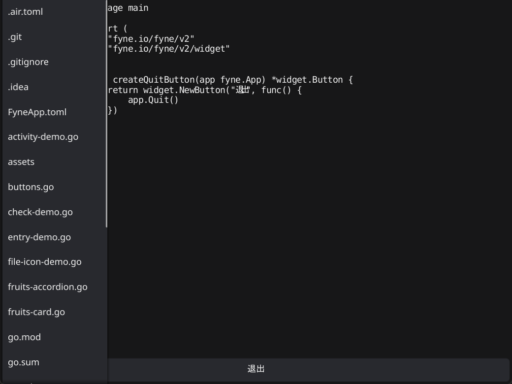
工具栏
描述
Toolbar widget creates a horizontal list of tool buttons.

收纳类组件(由widget包提供)
列表
描述
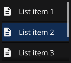
List provides a high performance vertical scroll of many sub-items.
源码
// List is a widget that pools list items for performance and
// lays the items out in a vertical direction inside of a scroller.
// By default, List requires that all items are the same size, but specific
// rows can have their heights set with SetItemHeight.
//
// Since: 1.4
type List struct {
    BaseWidget

    // Length is a callback for returning the number of items in the list.
    Length func() int `json:"-"`

    // CreateItem is a callback invoked to create a new widget to render
    // a row in the list.
    CreateItem func() fyne.CanvasObject `json:"-"`

    // UpdateItem is a callback invoked to update a list row widget
    // to display a new row in the list. The UpdateItem callback should
    // only update the given item, it should not invoke APIs that would
    // change other properties of the list itself.
    UpdateItem func(id ListItemID, item fyne.CanvasObject) `json:"-"`

    // OnSelected is a callback to be notified when a given item
    // in the list has been selected.
    OnSelected func(id ListItemID) `json:"-"`

    // OnSelected is a callback to be notified when a given item
    // in the list has been unselected.
    OnUnselected func(id ListItemID) `json:"-"`

    // HideSeparators hides the separators between list rows
    //
    // Since: 2.5
    HideSeparators bool

    currentFocus  ListItemID
    focused       bool
    scroller      *widget.Scroll
    selected      []ListItemID
    itemMin       fyne.Size
    itemHeights   map[ListItemID]float32
    offsetY       float32
    offsetUpdated func(fyne.Position)
}


// NewList creates and returns a list widget for displaying items in// a vertical layout with scrolling and caching for performance.
//
// Since: 1.4
func NewList(
	length func() int,
	createItem func() fyne.CanvasObject,
	updateItem func(ListItemID, fyne.CanvasObject),
) *List

// NewListWithData creates a new list widget that will display the contents of the provided data.
//
// Since: 2.0
func NewListWithData(
	data binding.DataList,
	createItem func() fyne.CanvasObject,
	updateItem func(binding.DataItem, fyne.CanvasObject),
) *List
代码示例
实在看不懂函数参数传参,所以参考AI的写了示例
func setContentToList(win fyne.Window, app fyne.App) {
    var fileLines []string
    fileLinedContent := widget.NewList(
       func() int {
          return len(fileLines) // list初始长度
       },
       func() fyne.CanvasObject {
          return widget.NewLabel("") // 新list项的样子, 不一定要是Label组件
       },
       func(id widget.ListItemID, item fyne.CanvasObject) {
          // 数据更新, 滚动列表时会高频调用
          label := item.(*widget.Label)
          if id < len(fileLines) { // 只渲染能看到的内容
             label.SetText(fileLines[id])
          }
       },
    )

    fileSelection := widget.NewSelect(la(), func(s string) {
       if s != "" {
          content, err := os.ReadFile(s)
          if err == nil {
             fileLines = strings.Split(string(content), "\n")
             fileLinedContent.Refresh()     // 显式更新组件
             fileLinedContent.ScrollToTop() // 把光标滚回去
          }
       }
    })

    quit := createQuitButton(app)

    win.SetContent(container.NewBorder(
       // top
       nil,
       //  bottom
       quit,
       // left
       container.NewVBox(fileSelection),
       // right
       nil,
       // center
       fileLinedContent,
    ))
}
演示
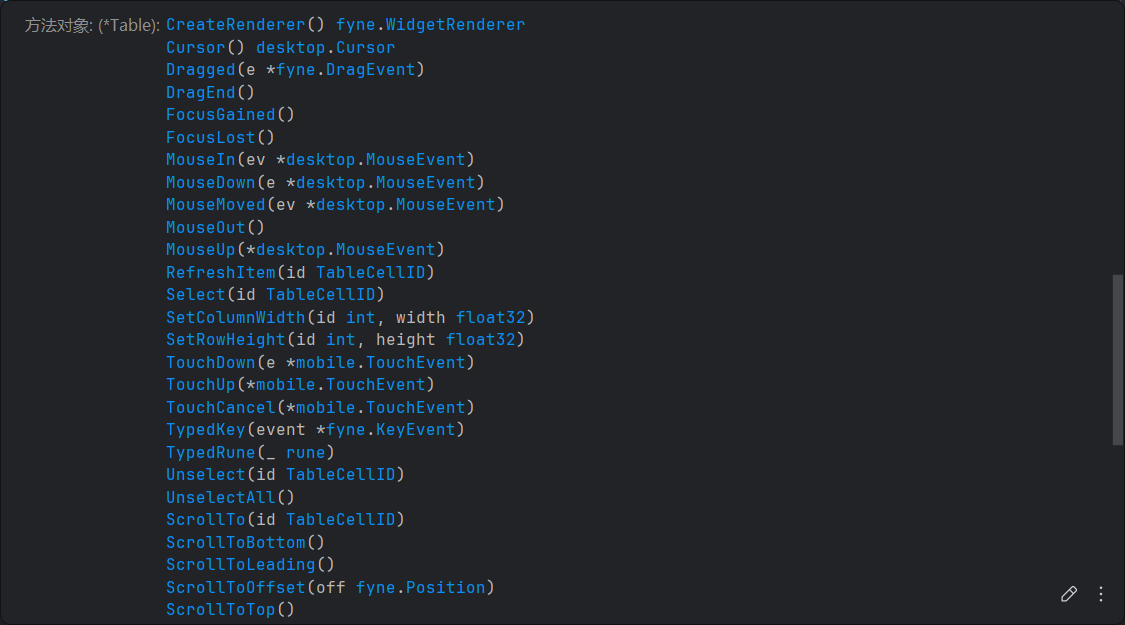
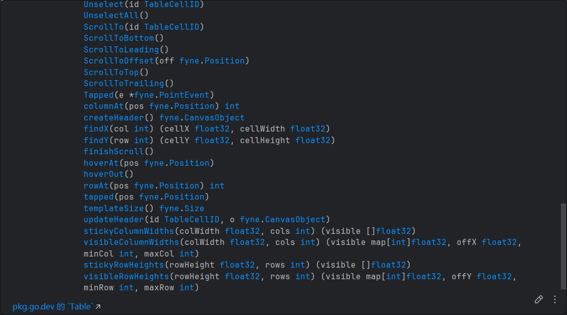
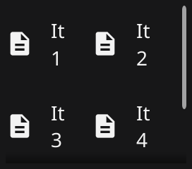
表格/Table
描述
Table provides a high performance scrolled two dimensional display of many sub-items.
源码
// Table widget is a grid of items that can be scrolled and a cell selected.
// Its performance is provided by caching cell templates created with CreateCell and re-using them with UpdateCell.
// The size of the content rows/columns is returned by the Length callback.
//
// Since: 1.4
type Table struct {
	BaseWidget

	Length       func() (rows int, cols int)                      `json:"-"`
	CreateCell   func() fyne.CanvasObject                         `json:"-"`
	UpdateCell   func(id TableCellID, template fyne.CanvasObject) `json:"-"`
	OnSelected   func(id TableCellID)                             `json:"-"`
	OnUnselected func(id TableCellID)                             `json:"-"`

	// ShowHeaderRow specifies that a row should be added to the table with header content.
	// This will default to an A-Z style content, unless overridden with `CreateHeader` and `UpdateHeader` calls.
	//
	// Since: 2.4
	ShowHeaderRow bool

	// ShowHeaderColumn specifies that a column should be added to the table with header content.
	// This will default to an 1-10 style numeric content, unless overridden with `CreateHeader` and `UpdateHeader` calls.
	//
	// Since: 2.4
	ShowHeaderColumn bool

	// CreateHeader is an optional function that allows overriding of the default header widget.
	// Developers must also override `UpdateHeader`.
	//
	// Since: 2.4
	CreateHeader func() fyne.CanvasObject `json:"-"`

	// UpdateHeader is used with `CreateHeader` to support custom header content.
	// The `id` parameter will have `-1` value to indicate a header, and `> 0` where the column or row refer to data.
	//
	// Since: 2.4
	UpdateHeader func(id TableCellID, template fyne.CanvasObject) `json:"-"`

	// StickyRowCount specifies how many data rows should not scroll when the content moves.
	// If `ShowHeaderRow` us `true` then the stuck row will appear immediately underneath.
	//
	// Since: 2.4
	StickyRowCount int

	// StickyColumnCount specifies how many data columns should not scroll when the content moves.
	// If `ShowHeaderColumn` us `true` then the stuck column will appear immediately next to the header.
	//
	// Since: 2.4
	StickyColumnCount int

	// HideSeparators hides the separator lines between the table cells
	//
	// Since: 2.5
	HideSeparators bool

	currentFocus              TableCellID
	focused                   bool
	selectedCell, hoveredCell *TableCellID
	cells                     *tableCells
	columnWidths, rowHeights  map[int]float32
	moveCallback              func()
	offset                    fyne.Position
	content                   *widget.Scroll

	cellSize, headerSize                                         fyne.Size
	stuckXOff, stuckYOff, stuckWidth, stuckHeight, dragStartSize float32
	top, left, corner, dividerLayer                              *clip
	hoverHeaderRow, hoverHeaderCol, dragCol, dragRow             int
	dragStartPos                                                 fyne.Position
}


// NewTable returns a new performant table widget defined by the passed functions.
// The first returns the data size in rows and columns, second parameter is a function that returns cell
// template objects that can be cached and the third is used to apply data at specified data location to the
// passed template CanvasObject.
//
// Since: 1.4
func NewTable(length func() (rows int, cols int), create func() fyne.CanvasObject, update func(TableCellID, fyne.CanvasObject)) *Table

// NewTableWithHeaders returns a new performant table widget defined by the passed functions including sticky headers.
// The first returns the data size in rows and columns, second parameter is a function that returns cell
// template objects that can be cached and the third is used to apply data at specified data location to the
// passed template CanvasObject.
// The row and column headers will stick to the leading and top edges of the table and contain "1-10" and "A-Z" formatted labels.
//
// Since: 2.4
func NewTableWithHeaders(length func() (rows int, cols int), create func() fyne.CanvasObject, update func(TableCellID, fyne.CanvasObject)) *Table


// TableCellID is a type that represents a cell's position in a table based on its row and column location.
type TableCellID struct {
    Row int
    Col int
}
代码示例
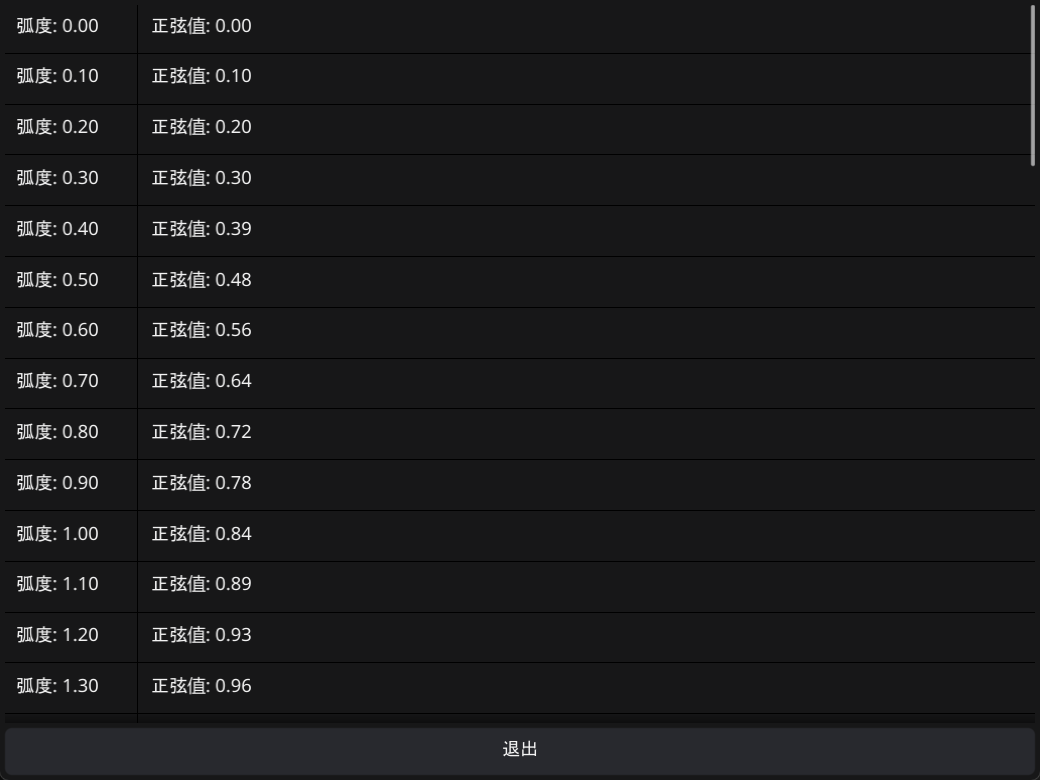
type sineData struct {
	radius float64
	sine   float64
}

func iterateSine(min, max, step float64) []sineData {
	res := make([]sineData, 0)

	for angle := min; angle <= max; angle += step {
		v := math.Sin(angle)

		res = append(res, sineData{radius: angle, sine: v})
	}
	return res
}
func setContentToTable(win fyne.Window, app fyne.App) {
	// table := widget.NewTable()
	mapping := iterateSine(0, 2*math.Pi, 0.1)

	sinTable := widget.NewTable(
		func() (rows, cols int) {
			return len(mapping), 2
		},
		func() fyne.CanvasObject {
			return widget.NewLabel("")
		},
		func(id widget.TableCellID, cell fyne.CanvasObject) { // 这里取到的ID是整数
			label := cell.(*widget.Label)

			if id.Row < len(mapping) {
				switch {
				case id.Col == 0:
					label.SetText(fmt.Sprintf("弧度: %.2f", mapping[id.Row].radius))
				case id.Col == 1:
					label.SetText(fmt.Sprintf("正弦值: %.2f", mapping[id.Row].sine))
				}
			}
		},
	)
	sinTable.SetColumnWidth(0, 100) // Table不会自动设置列宽
	sinTable.SetColumnWidth(1, 200)

	quit := createQuitButton(app)
	win.SetContent(container.NewBorder(
		// top
		nil,
		//  bottom
		quit,
		// left
		nil,
		// right
		nil,
		// center
		sinTable,
	))
}
演示
多级列表/Tree
描述
Tree provides a high performance vertical scroll of items that can be expanded to reveal child elements..
源码
// Tree widget displays hierarchical data.
// Each node of the tree must be identified by a Unique TreeNodeID.
//
// Since: 1.4
type Tree struct {
	BaseWidget
	Root TreeNodeID

	// HideSeparators hides the separators between tree nodes
	//
	// Since: 2.5
	HideSeparators bool

	ChildUIDs      func(uid TreeNodeID) (c []TreeNodeID)                     `json:"-"` // Return a sorted slice of Children TreeNodeIDs for the given Node TreeNodeID
	CreateNode     func(branch bool) (o fyne.CanvasObject)                   `json:"-"` // Return a CanvasObject that can represent a Branch (if branch is true), or a Leaf (if branch is false)
	IsBranch       func(uid TreeNodeID) (ok bool)                            `json:"-"` // Return true if the given TreeNodeID represents a Branch
	OnBranchClosed func(uid TreeNodeID)                                      `json:"-"` // Called when a Branch is closed
	OnBranchOpened func(uid TreeNodeID)                                      `json:"-"` // Called when a Branch is opened
	OnSelected     func(uid TreeNodeID)                                      `json:"-"` // Called when the Node with the given TreeNodeID is selected.
	OnUnselected   func(uid TreeNodeID)                                      `json:"-"` // Called when the Node with the given TreeNodeID is unselected.
	UpdateNode     func(uid TreeNodeID, branch bool, node fyne.CanvasObject) `json:"-"` // Called to update the given CanvasObject to represent the data at the given TreeNodeID

	branchMinSize fyne.Size
	currentFocus  TreeNodeID
	focused       bool
	leafMinSize   fyne.Size
	offset        fyne.Position
	open          map[TreeNodeID]bool
	scroller      *widget.Scroll
	selected      []TreeNodeID
}


// NewTree returns a new performant tree widget defined by the passed functions.// childUIDs returns the child TreeNodeIDs of the given node.
// isBranch returns true if the given node is a branch, false if it is a leaf.
// create returns a new template object that can be cached.
// update is used to apply data at specified data location to the passed template CanvasObject.
//
// Since: 1.4
func NewTree(
	childUIDs func(TreeNodeID) []TreeNodeID,
	isBranch func(TreeNodeID) bool,
	create func(bool) fyne.CanvasObject,
	update func(TreeNodeID, bool, fyne.CanvasObject),
) *Tree

// NewTreeWithData creates a new tree widget that will display the contents of the provided data.
//
// Since: 2.4
func NewTreeWithData(data binding.DataTree, createItem func(bool) fyne.CanvasObject, updateItem func(binding.DataItem, bool, fyne.CanvasObject)) *Tree

// NewTreeWithStrings creates a new tree with the given string map.
// Data must contain a mapping for the root, which defaults to empty string ("").
//
// Since: 1.4
func NewTreeWithStrings(data map[string][]string) (t *Tree)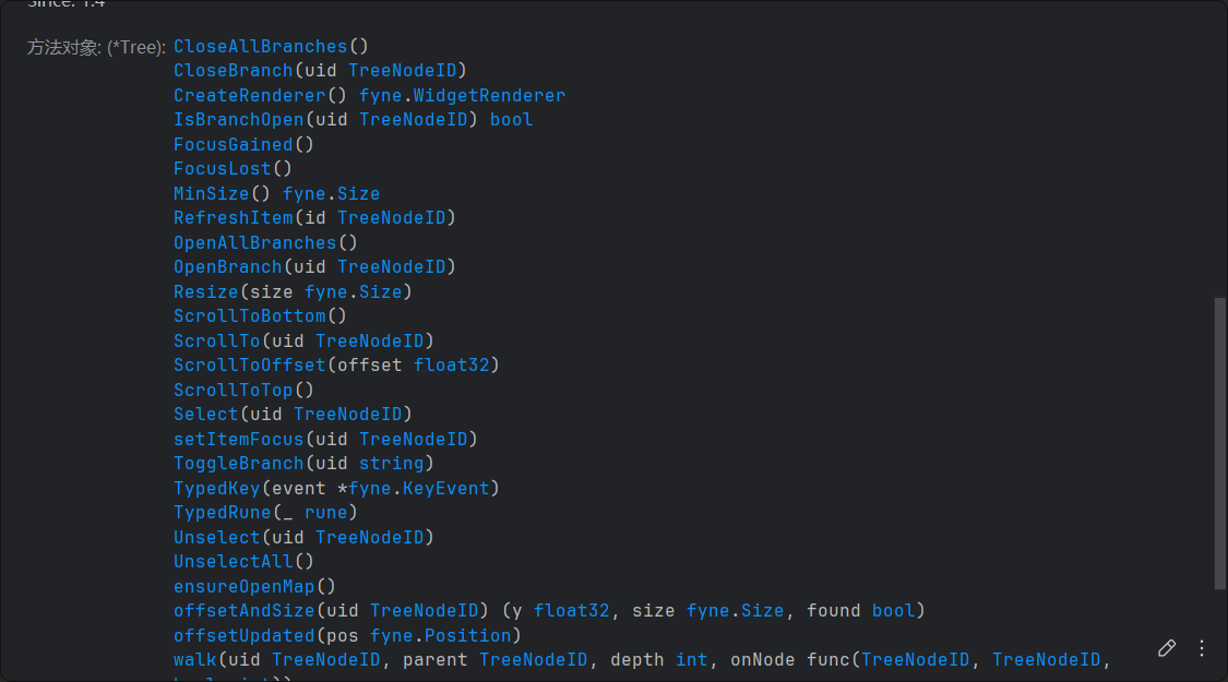

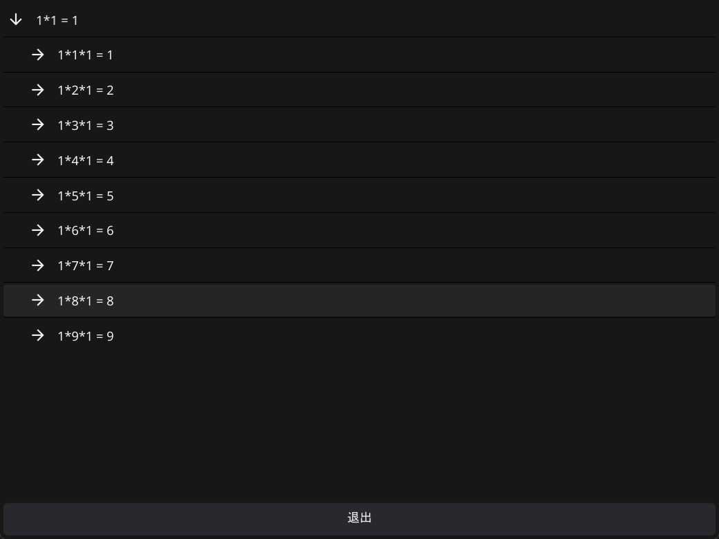
代码示例
玩不明白
func setContentToTree(win fyne.Window, app fyne.App) {
    baseUIDs := []widget.TreeNodeID{
       "1", "2", "3", "4", "5", "6", "7", "8", "9",
    }
    // treeDepth := 3
    var tree *widget.Tree
    // var depth = 3
    // var currentDepth = 0
    tree = widget.NewTree(
       func(id widget.TreeNodeID) []widget.TreeNodeID { // 生成子节点
          res := make([]widget.TreeNodeID, 0)
          for _, uid := range baseUIDs {
             var newUID widget.TreeNodeID
             if id == "" {
                newUID = fmt.Sprintf("%s-%s", tree.Root, uid)
                // newUID = uid
             } else {
                newUID = fmt.Sprintf("%s-%s", id, uid)
             }
             res = append(res, newUID)
             // log.Printf("id: %s, uid: %s full uid: %s", id, uid, newUID)
          }
          return res
       },
       func(id widget.TreeNodeID) bool { // 判断是否为分支(不是叶子)
          numberUIDs := strings.Split(id, "-")
          return len(numberUIDs) <= 2
       },
       func(b bool) fyne.CanvasObject { // create

          return widget.NewLabel("")
       },
       func(id widget.TreeNodeID, b bool, object fyne.CanvasObject) { // update
          label := object.(*widget.Label)
          if b {
             numberUIDs := strings.Split(id, "-")
             product := 1
             textBuilder := strings.Builder{}
             for _, uid := range numberUIDs {
                number, err := strconv.Atoi(uid)
                if err != nil {
                   number = 1
                }
                product *= number
                textBuilder.WriteString(fmt.Sprintf("%d*", number))
             }
             // log.Printf("[%v] %v", id, product)
             textBuilder.WriteString(fmt.Sprintf("1 = %d", product))
             label.SetText(textBuilder.String())
             label.Refresh()
          }
       },
    )
    tree.Root = "1"
    log.Printf("Root Node Id: %v", tree.Root)

    quit := createQuitButton(app)

    win.SetContent(container.NewBorder(
       // top
       nil,
       //  bottom
       quit,
       // left
       nil,
       // right
       nil,
       // center
       tree,
    ))

}
演示
折叠等宽组件/GridWrap
描述
GridWrap is a collection widget that display each child item at the same size and wraps them to new lines as required.
容器组件(由container包提供)
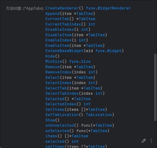
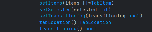
标签页/AppTabs
描述
AppTabs widget allows switching visible content from a list of TabItems. Each item is represented by a button at the top of the widget.

源码
// TabItem represents a single view in a tab view.
// The Text and Icon are used for the tab button and the Content is shown when the corresponding tab is active.
//
// Since: 1.4
type TabItem struct {
	Text    string
	Icon    fyne.Resource
	Content fyne.CanvasObject

	button *tabButton

	disabled bool
}
// NewTabItem creates a new item for a tabbed widget - each item specifies the content and a label for its tab.
//
// Since: 1.4
func NewTabItem(text string, content fyne.CanvasObject) *TabItem {
	return &TabItem{Text: text, Content: content}
}

// NewTabItemWithIcon creates a new item for a tabbed widget - each item specifies the content and a label with an icon for its tab.
//
// Since: 1.4
func NewTabItemWithIcon(text string, icon fyne.Resource, content fyne.CanvasObject) *TabItem {
	return &TabItem{Text: text, Icon: icon, Content: content}
}

// AppTabs container is used to split your application into various different areas identified by tabs.
// The tabs contain text and/or an icon and allow the user to switch between the content specified in each TabItem.
// Each item is represented by a button at the edge of the container.
//
// Since: 1.4
type AppTabs struct {
	widget.BaseWidget

	Items []*TabItem

	// Deprecated: Use `OnSelected func(*TabItem)` instead.
	OnChanged    func(*TabItem) `json:"-"`
	OnSelected   func(*TabItem) `json:"-"`
	OnUnselected func(*TabItem) `json:"-"`

	current         int
	location        TabLocation
	isTransitioning bool

	popUpMenu *widget.PopUpMenu
}

// NewAppTabs creates a new tab container that allows the user to choose between different areas of an app.
//
// Since: 1.4
func NewAppTabs(items ...*TabItem) *AppTabs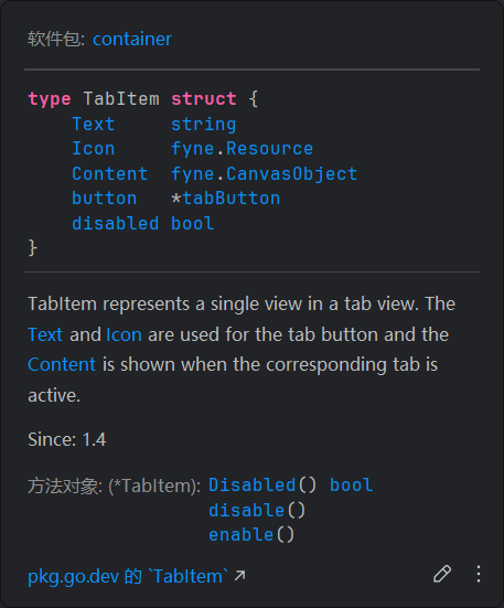
代码示例
演示
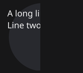
扇形切片/Clip
描述
Clip is a container that shows only a portion of the Content, as defined by the size of the clip.
源码
// Clip describes a rectangular region  that will clip anything outside its bounds.//
// Since: 2.7
type Clip struct {
    widget.BaseWidget
    Content fyne.CanvasObject
}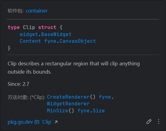
// NewClip returns a new rectangular clipping object.//
// Since: 2.7
func NewClip(content fyne.CanvasObject) *Clip {
    return &Clip{Content: content}
}
代码示例
依旧不懂怎么用
演示
导航键/Navigation
描述
The Navigation container provides a stack based navigation where items can be Pushed onto and the user can nagivate back and forwards.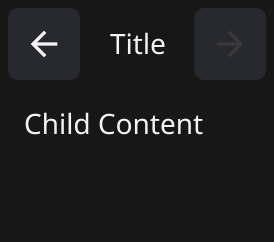
源码
// Navigation container is used to provide your application with a control bar and an area for content objects.// Objects can be any CanvasObject, and only the most recent one will be visible.
//
// Since: 2.7
type Navigation struct {
    widget.BaseWidget

    Root      fyne.CanvasObject
    Title     string
    OnBack    func()
    OnForward func()

    level  int
    stack  fyne.Container
    titles []string
}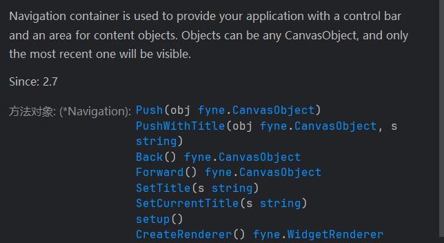
// NewNavigation creates a new navigation container with a given root object.//
// Since: 2.7
func NewNavigation(root fyne.CanvasObject) *Navigation {
    return NewNavigationWithTitle(root, "")
}

// NewNavigationWithTitle creates a new navigation container with a given root object and a default title.//
// Since: 2.7
func NewNavigationWithTitle(root fyne.CanvasObject, s string) *Navigation {
    var nav *Navigation
    nav = &Navigation{
       Root:      root,
       Title:     s,
       OnBack:    func() { _ = nav.Back() },
       OnForward: func() { _ = nav.Forward() },
    }
    return nav
}
代码示例
type titledCanvasObject struct {
    title string
    fyne.CanvasObject
}

func setContentToNavigation(win fyne.Window, app fyne.App) {
    quit := createQuitButton(app)

    contents := []titledCanvasObject{
       {"Title", widget.NewLabel("Portal Intro")},
       {"Content", widget.NewLabel(`Welcome to the aperture science center`)},
       {"Developer", widget.NewLabel("Valve")},
       {"Quit", quit},
    }
    currentIndex := 0
    navigationBar := container.NewNavigationWithTitle(contents[currentIndex].CanvasObject, contents[currentIndex].title)

    nextPageButton := widget.NewButton("Next", func() {
       currentIndex++
       if currentIndex >= len(contents) {
          currentIndex = len(contents) - 1
          return
       }
       navigationBar.PushWithTitle(contents[currentIndex].CanvasObject, contents[currentIndex].title)
       /*
       Push是一个压栈操作, 将最新的元素压入栈顶,隐藏之前的其他元素
       不要理解为翻页操作, 更不要在初始化时一口气压入所有元素, 否则会隐藏栈顶之下的其他元素
       Navigation的Back()方法会自动移动栈指针,显示栈指针所指向的元素
       一般来说默认行为已经够用了
       */       navigationBar.SetCurrentTitle(contents[currentIndex].title)
       // 如果是带标题的元素, 最好手动更新一下标题, 顺便维护一个变量管理元素列表的索引状态
    })

    win.SetContent(container.NewBorder(
       // top
       navigationBar,
       //  bottom
       container.NewHBox(nextPageButton),
       // left
       nil,
       // right
       nil,
       // center
       nil,
    ))
}
演示
滚动条/Scroll
描述
A Scroll container defines an area that is smaller than the Content, providing scrollbars as required.

多栏布局/Split
描述
The Split container defines a container whose size is split between two children.